PT-BR
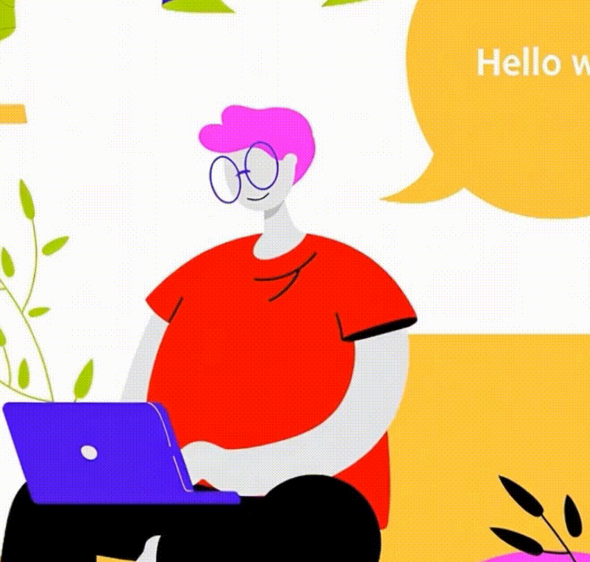
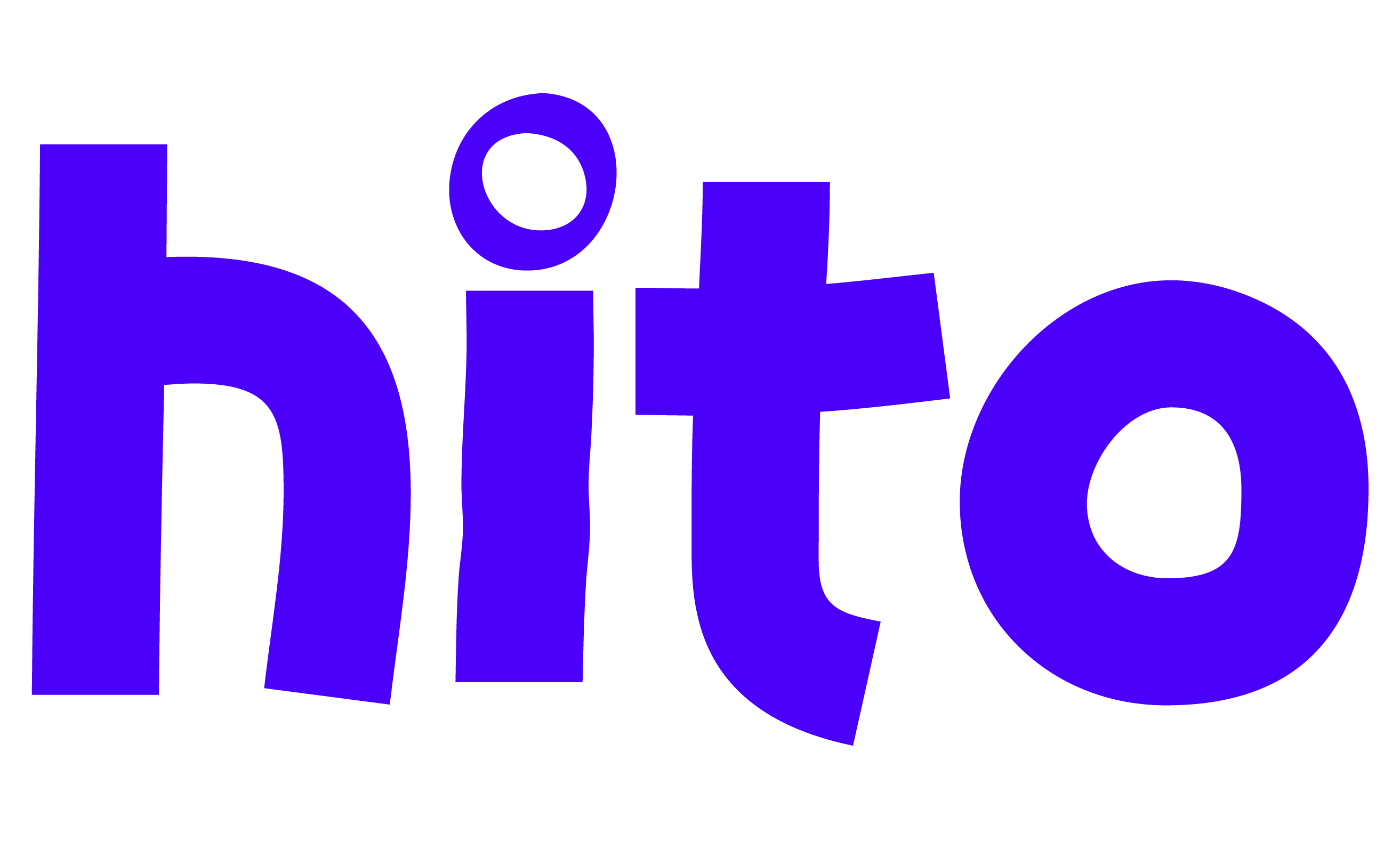
O João é um dev que estava a procura de uma identidade visual que refletisse o cerne tecnológico e inovador da área. O desafio foi criar uma ID atemporal, memorável e que refletisse o ambiente nativo do desenvolvedor.
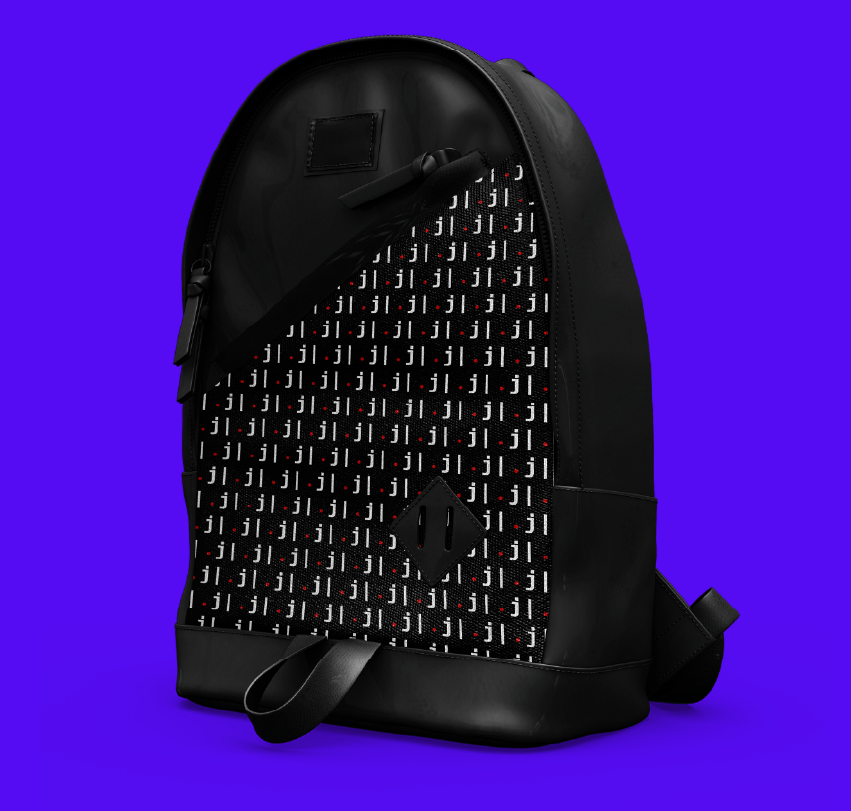
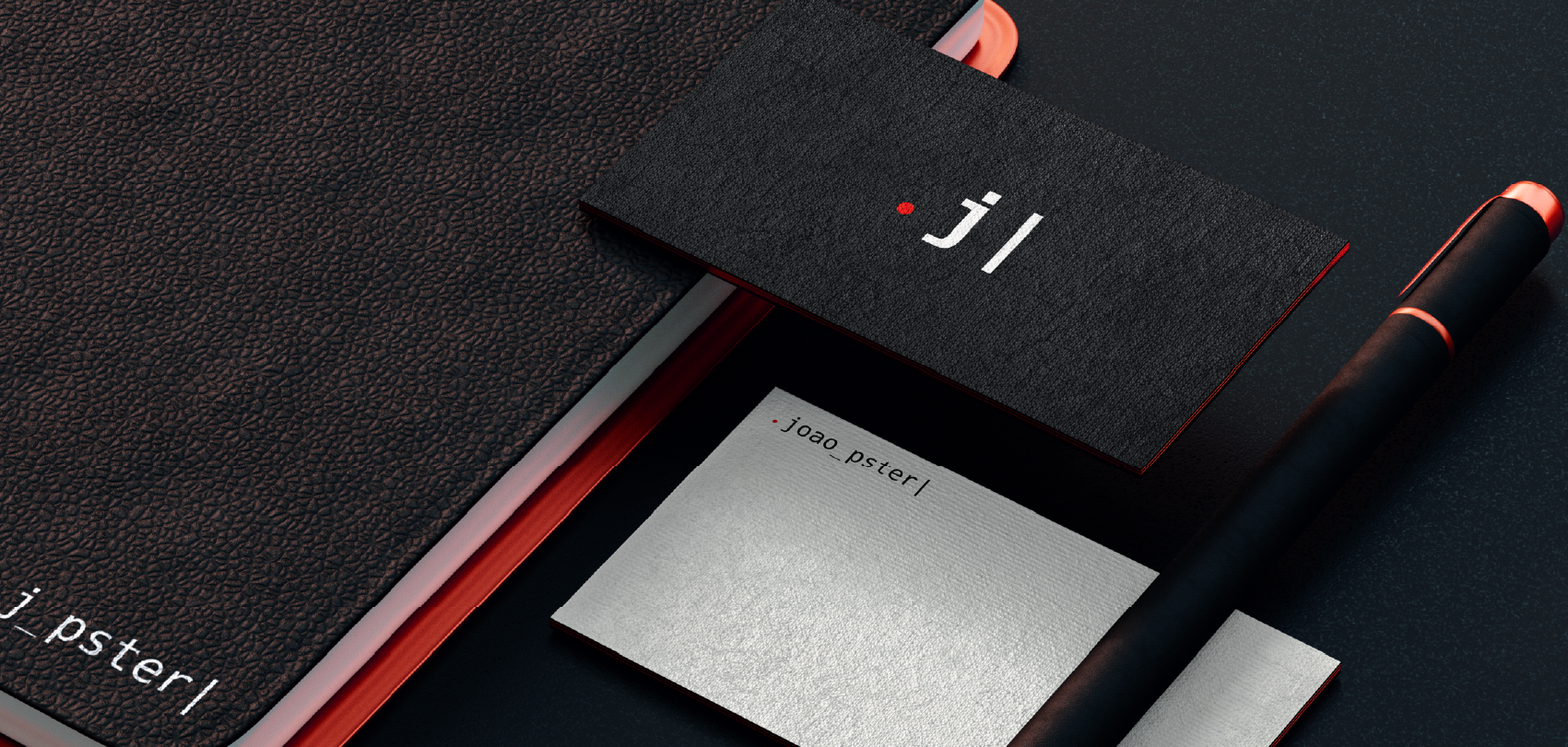
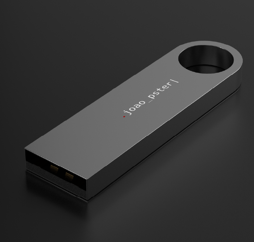
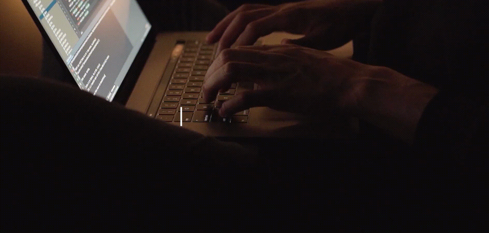
O símbolo é a abreviação do nome da marca, deixando o ponto, que seria o início do comando, o j do “joão” e a barra, mostrando que algo mais será digitado, que está apensa no início. Também foi usada uma tipografia toda em caixa baixa e sem acentos buscando reproduzir de forma mais fiel uma tela de programação.
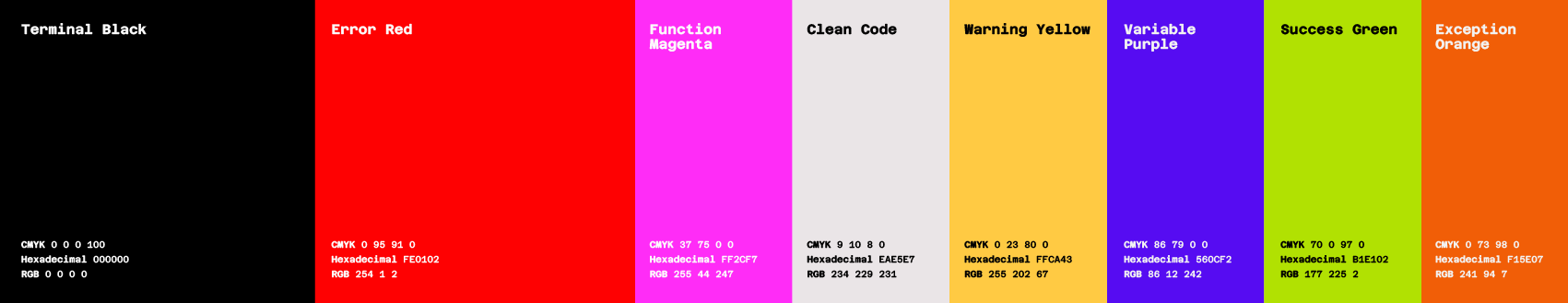
As cores usadas trazem a mensagem de uma marca jovem, moderna e inovadora; que ao mesmo tempo também é séria e comprometida.
O símbolo é a abreviação do nome da marca, deixando o ponto, que seria o início do comando, o j do “joão” e a barra, mostrando que algo mais será digitado, que está apensa no início. Também foi usada uma tipografia toda em caixa baixa e sem acentos buscando reproduzir de forma mais fiel uma tela de programação.
As cores usadas trazem a mensagem de uma marca jovem, moderna e inovadora; que ao mesmo tempo também é séria e comprometida.
EN
João is a developer who was looking for a visual identity that would reflect the technological and innovative core of the area. The challenge was to create an ID that was timeless, memorable and reflected the developer's native environment.
The symbol is the abbreviation of the brand name, leaving the dot, which would be the beginning of the command, the j in “john” and the slash, showing that something else will be typed, which is attached to the beginning. A typography all in lowercase and without accents was also used in order to more faithfully reproduce a programming screen.
The colors used bring the message of a young, modern and innovative brand; which at the same time is also serious and committed.