PT-BR
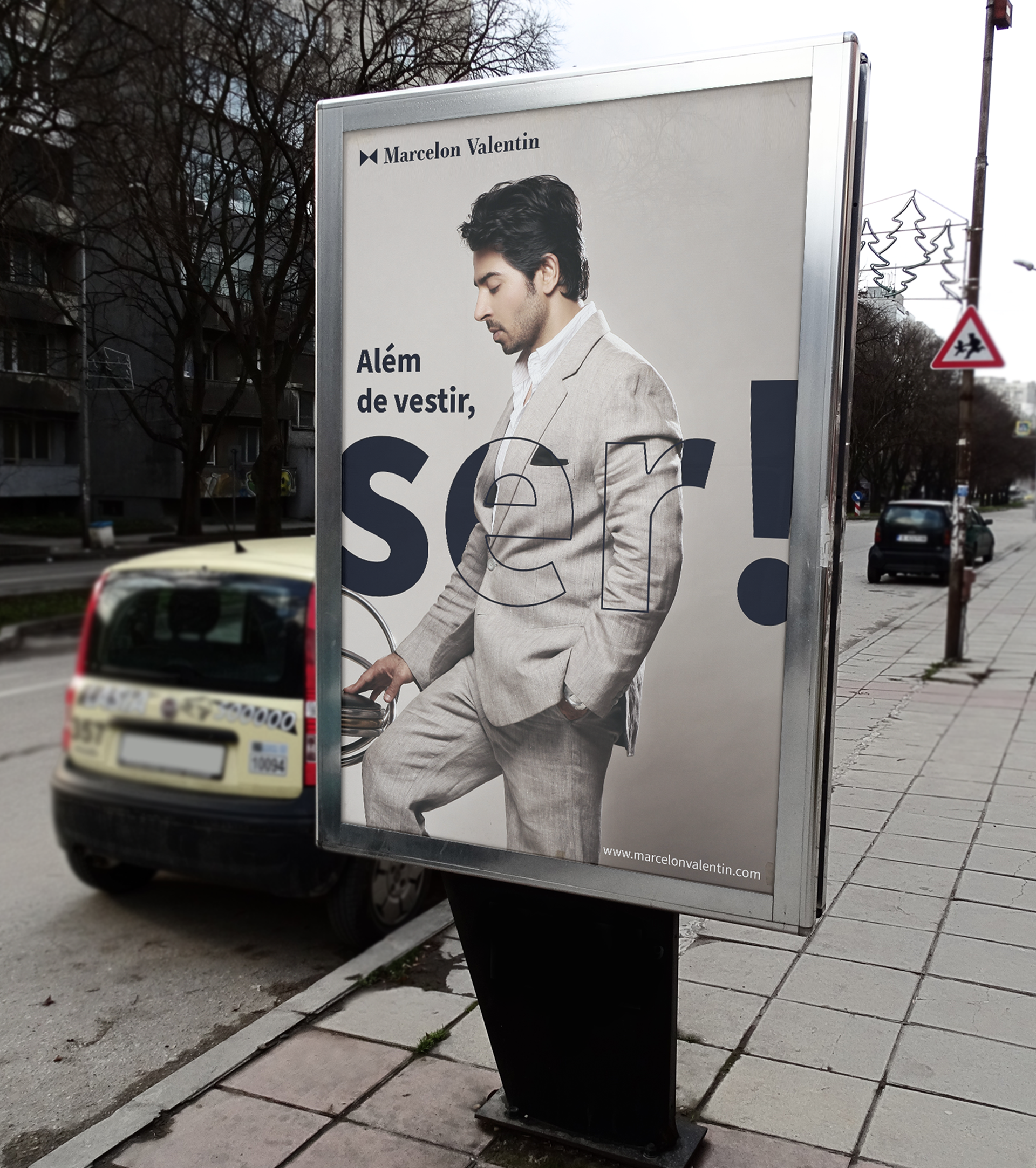
A Marcelon Valentin é uma marca voltada para o mundo da moda masculina, buscando atingir homens elegantes e poderosos que sabem o poder que uma boa vestimenta carrega, e como suas roupas conseguem externalizar quem ele de fato é.
Seu CEO e fundador, Mateus Guedes, tem descendência europeia e escolheu o nome de seus avós, Marcelo e Valentin, para nomear a marca com o propósito de trazer para a mesma tradicionalidade e elegância deles.
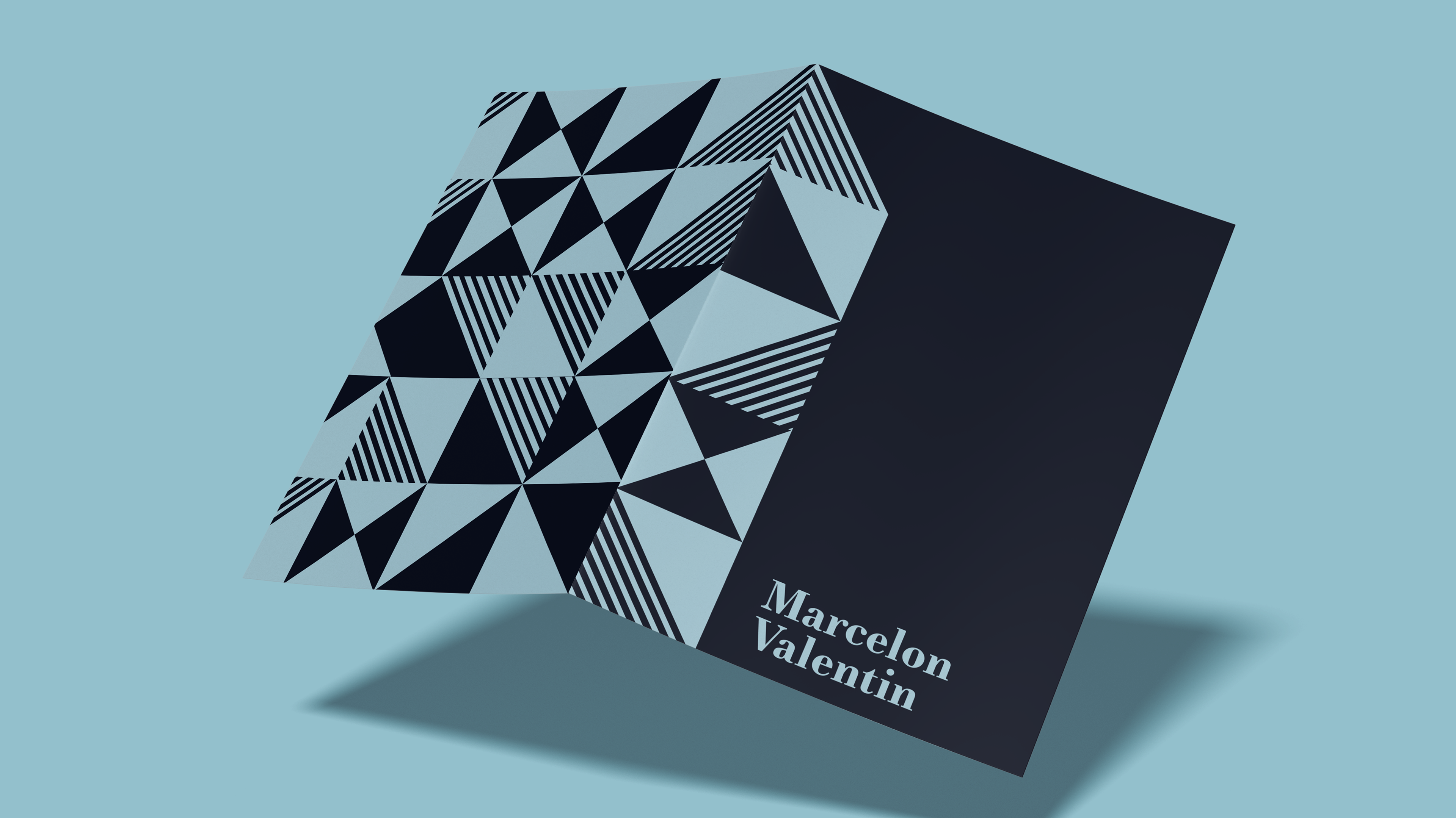
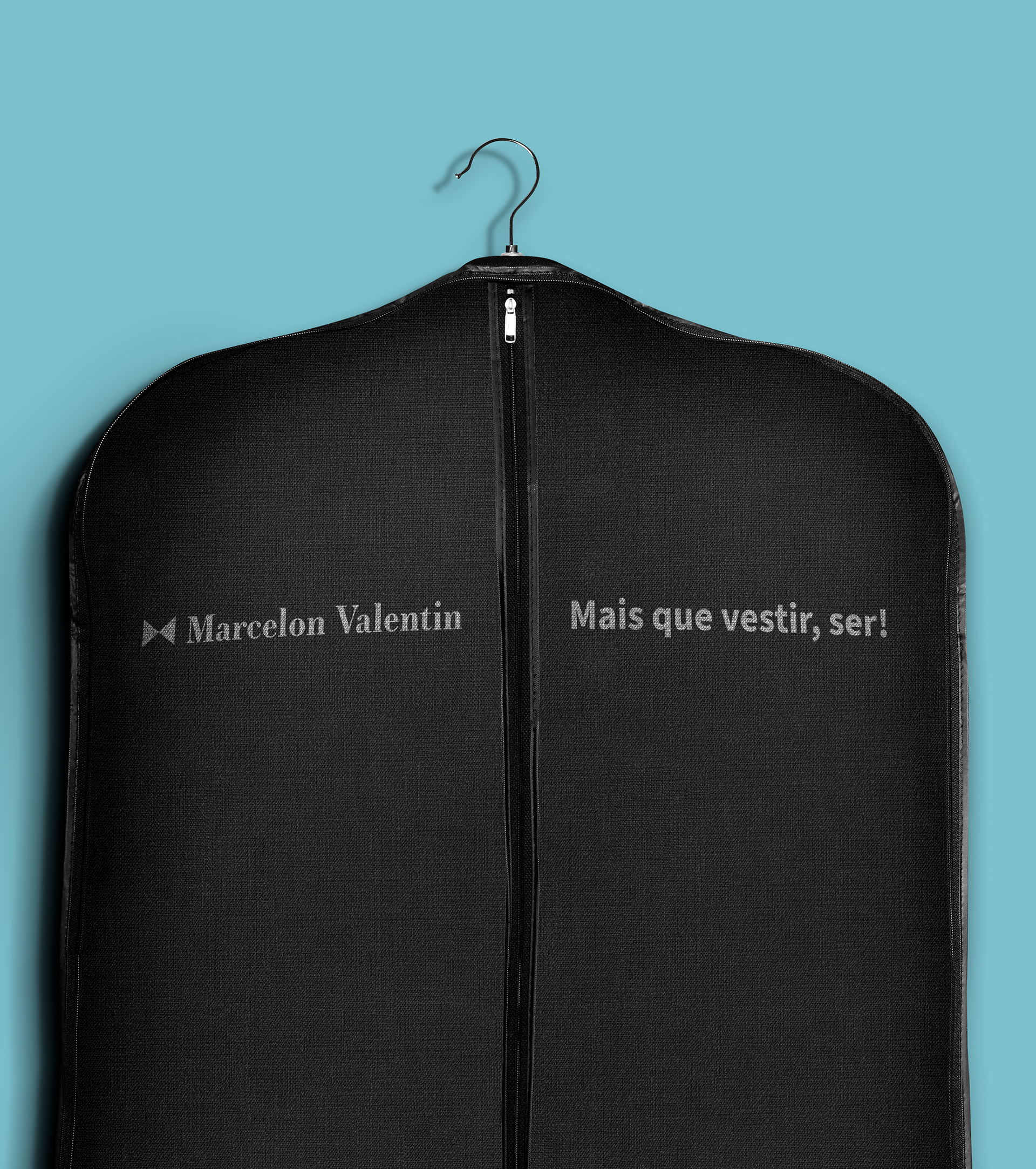
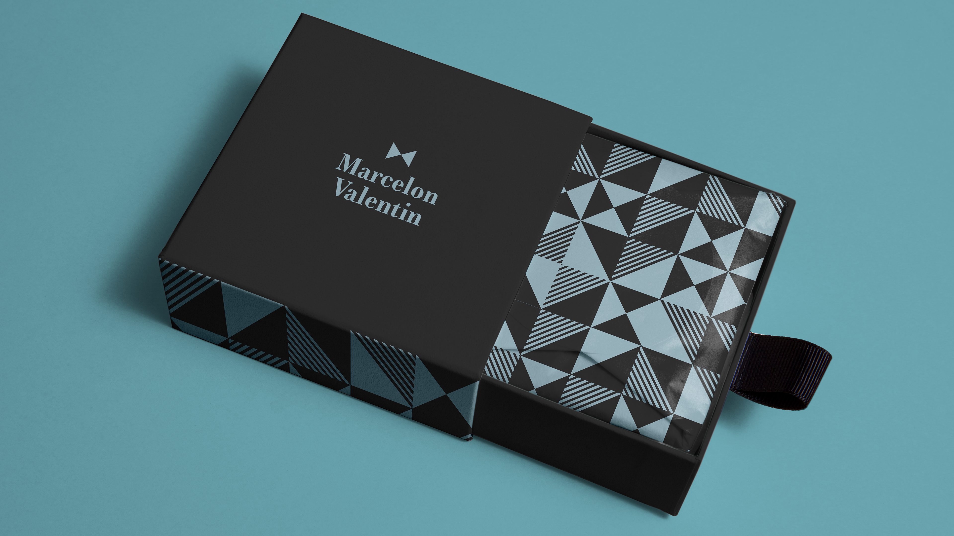
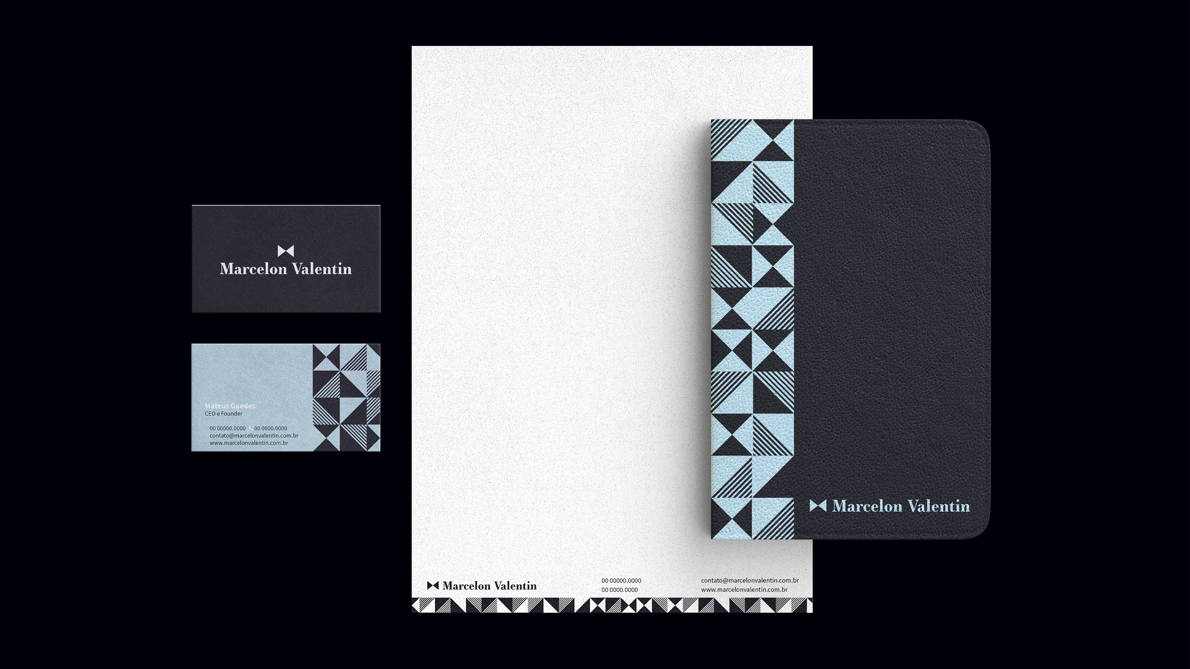
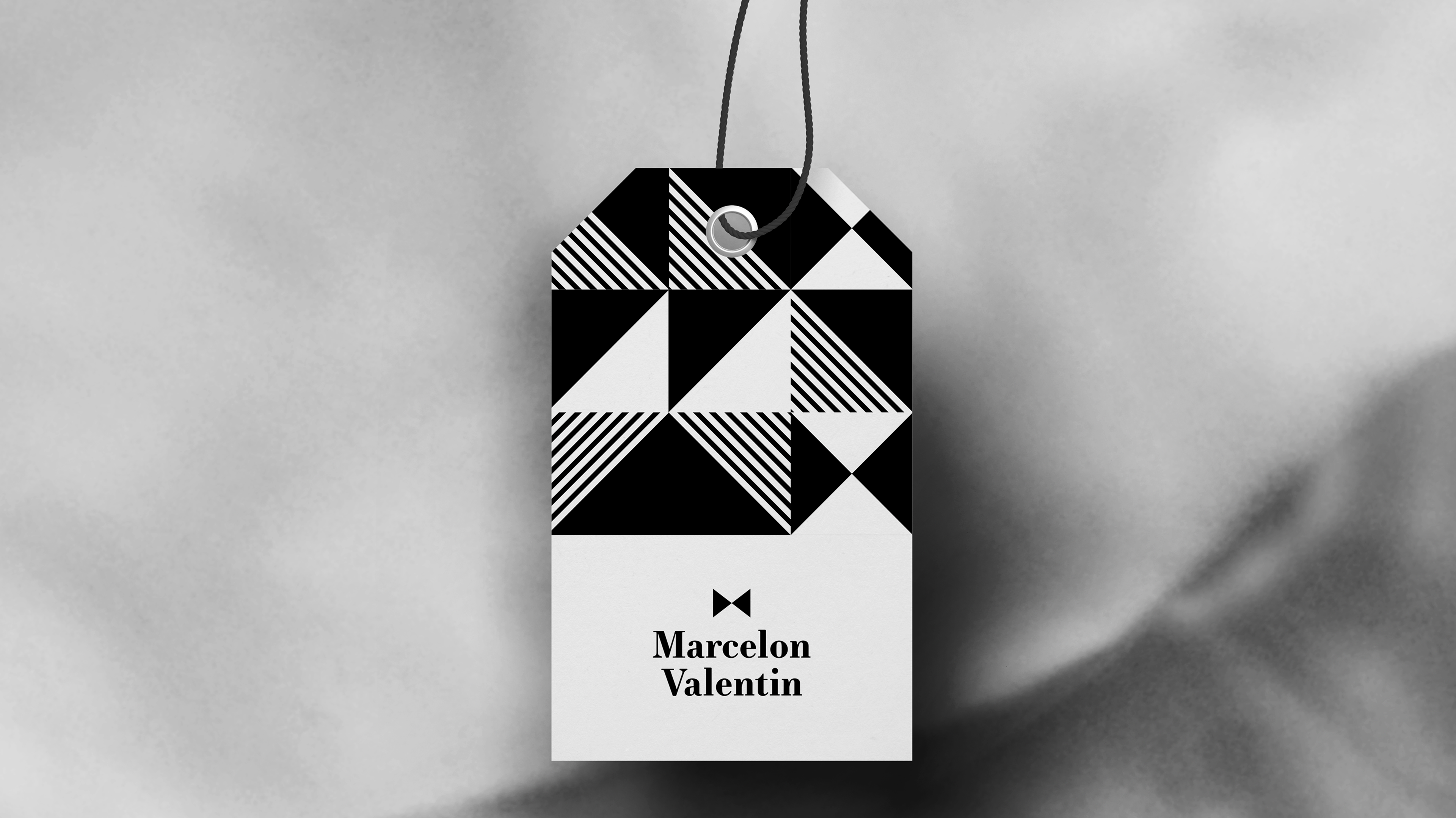
Sua identidade visual da Marcelon Valentin reflete o nível social elevado de seus clientes, assim como seu apreço por trajes que carregam qualidade, exclusividade e personalidade; para atingirmos o objetivo, fizemos uso do minimalismo, trazendo a ideia do “menos é mais” para a concepção da identidade da marca.
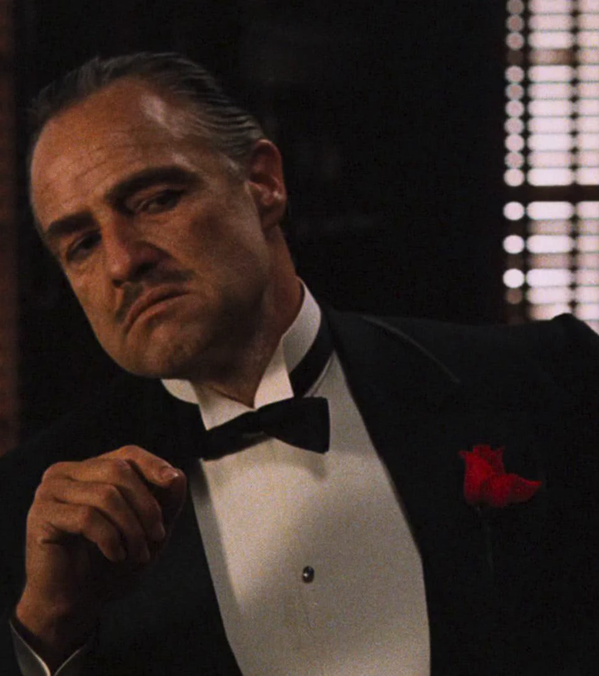
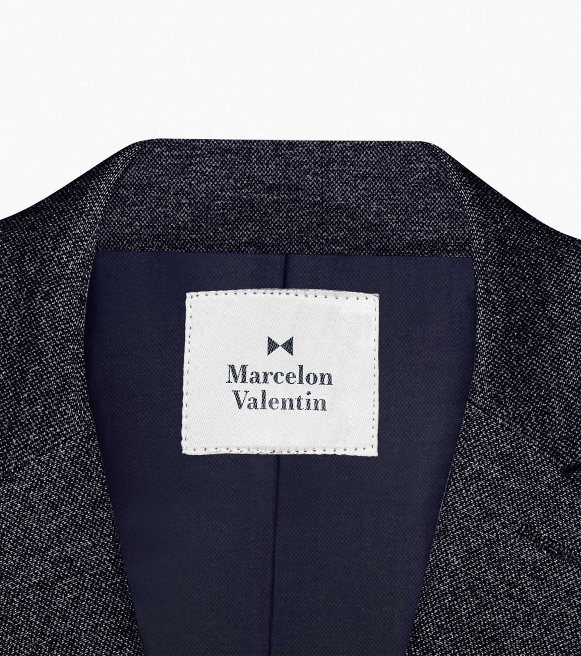
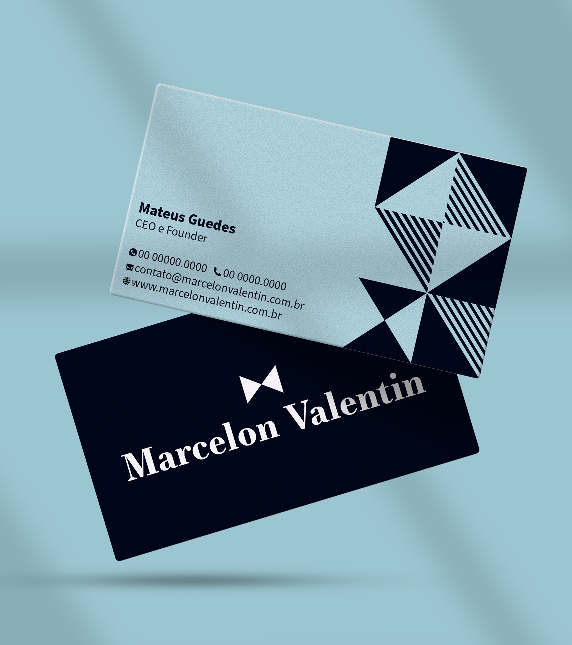
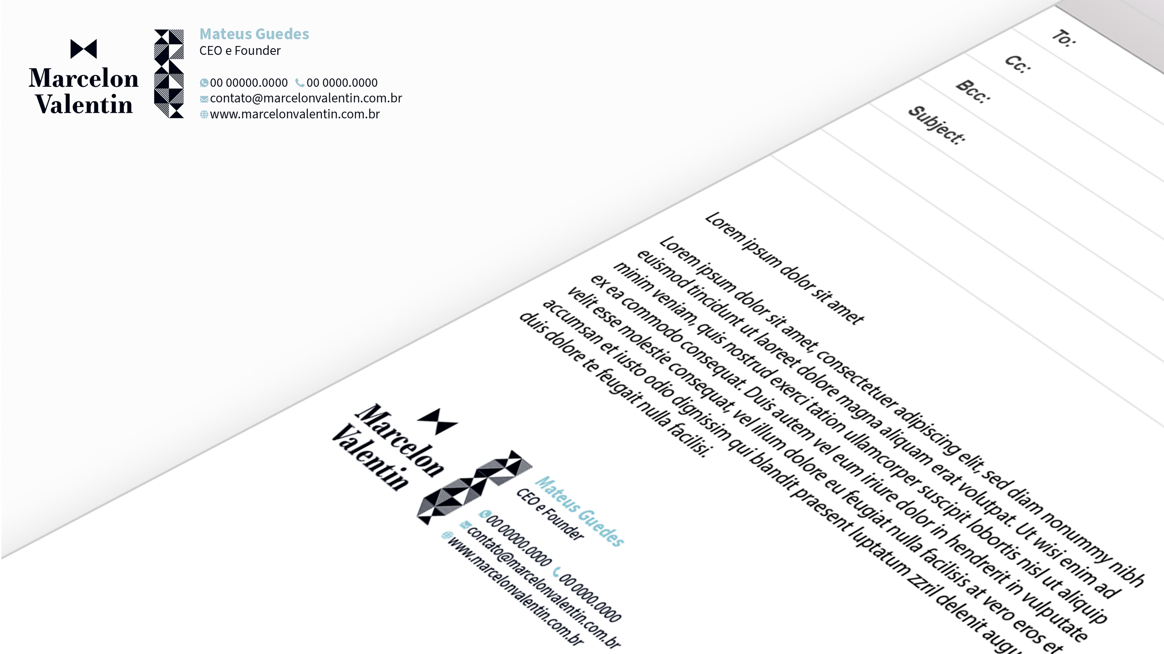
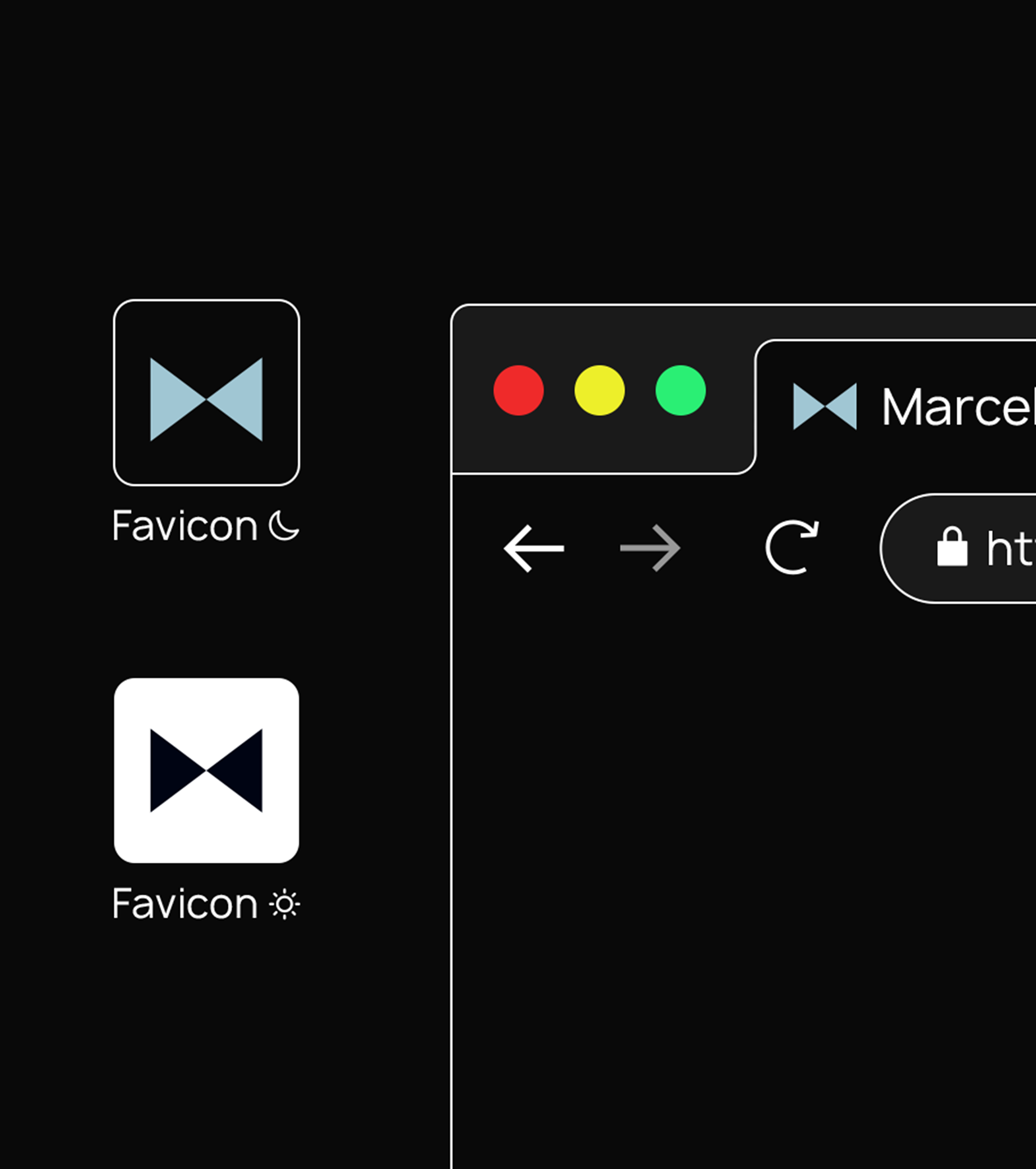
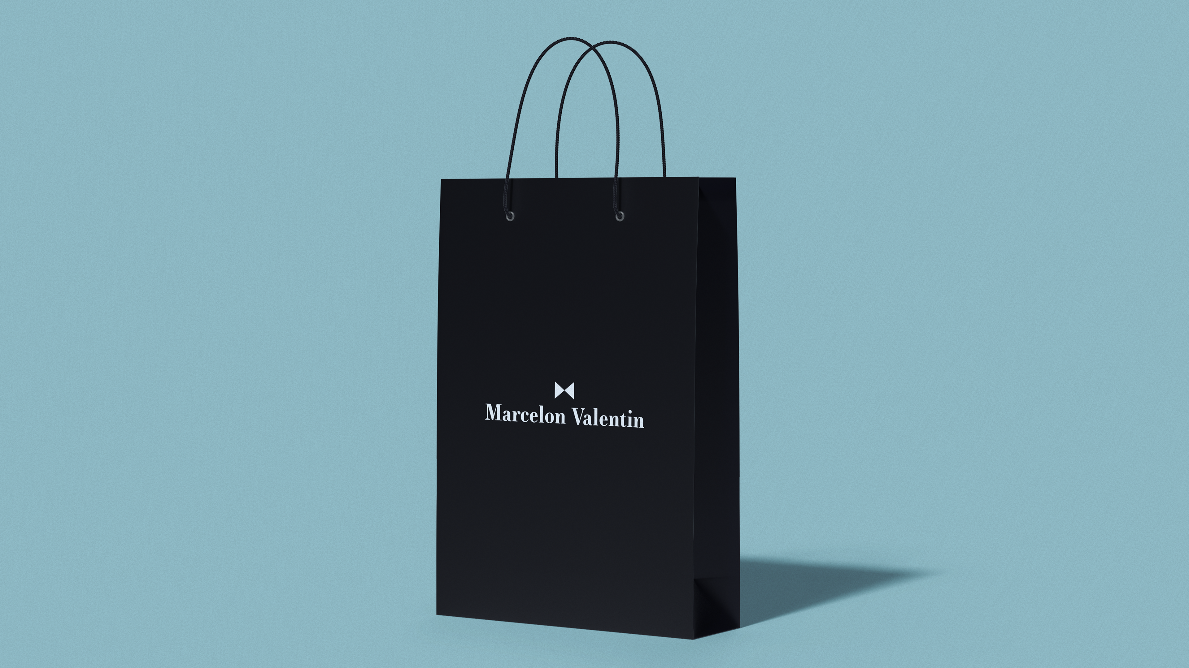
Os dois triângulos, quando juntos, ilustram uma gravata borboleta, fazendo alusão a uma peça tradicional do vestuário do homem elegante, e também remetendo ao Poderoso Chefão, filme que resgata a classe e a elegância do homem de poder. Quando isolado, o triângulo representa o masculino, o equilíbrio e a harmonia.
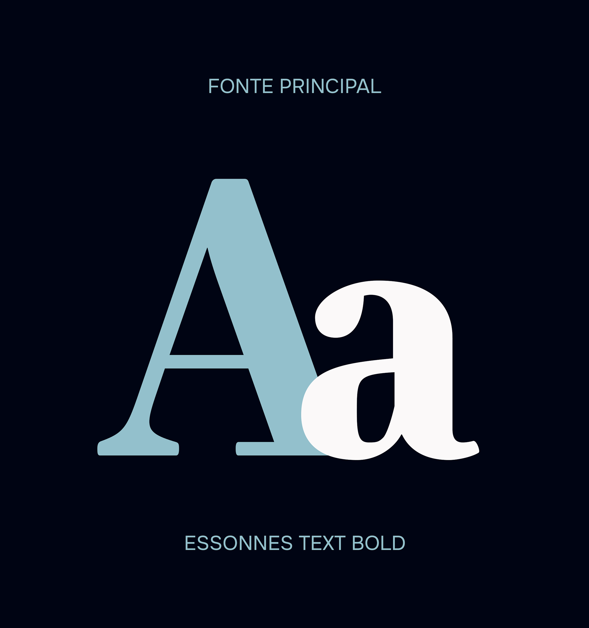
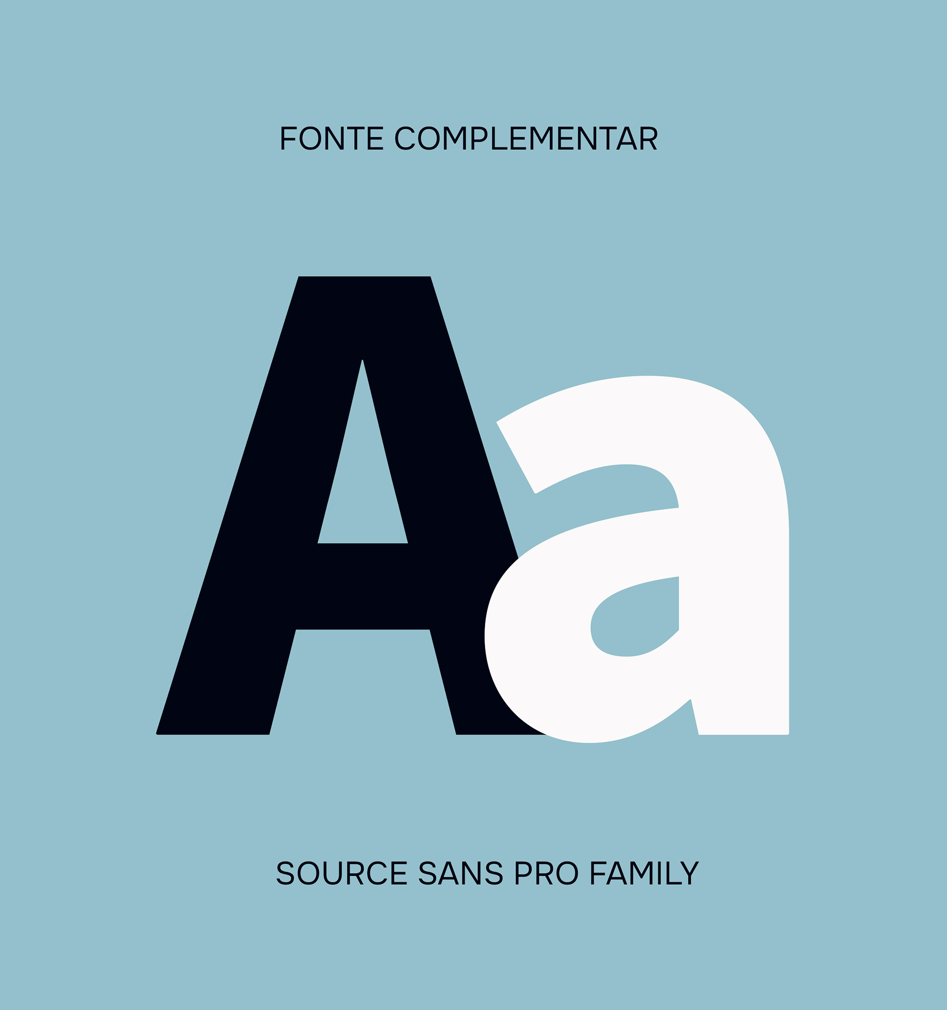
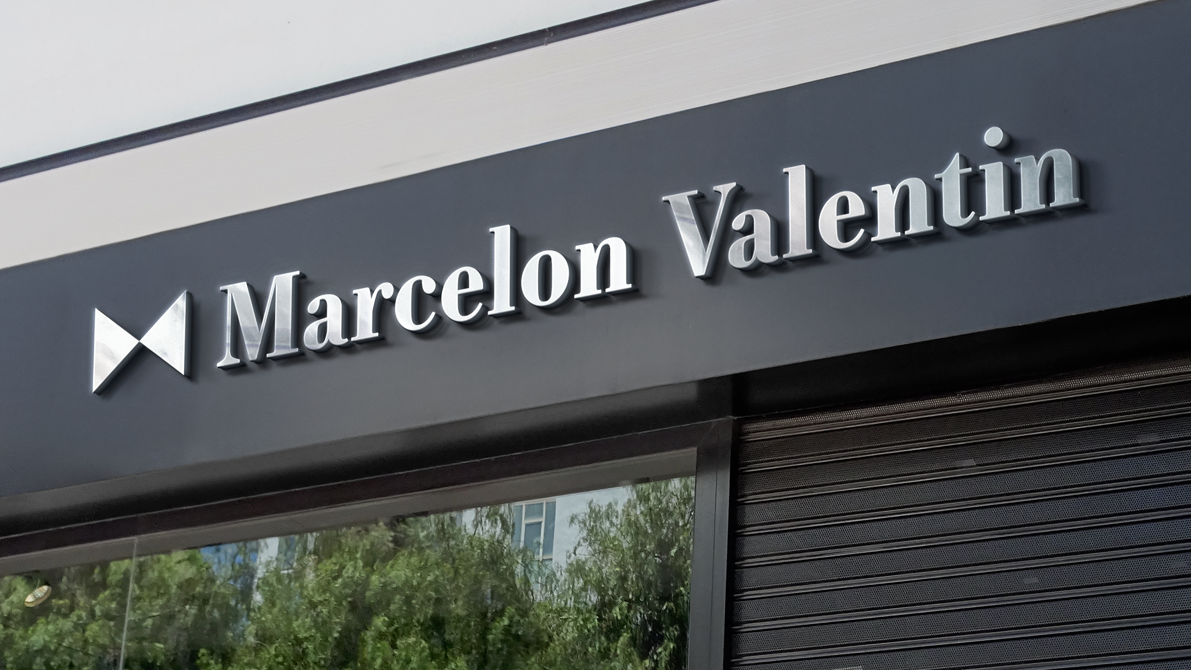
A tipografia escolhida, é uma fonte serifada que reforça a mensagem de uma marca clássica e tradicional. O nome da marca é escrito com letras em caixa alta e em caixa baixa, para trazer movimento para sua identidade.
A Marcelon Valentin é uma marca voltada para o mundo da moda masculina, buscando atingir homens elegantes e poderosos que sabem o poder que uma boa vestimenta carrega, e como suas roupas conseguem externalizar quem ele de fato é.
Seu CEO e fundador, Mateus Guedes, tem descendência europeia e escolheu o nome de seus avós, Marcelo e Valentin, para nomear a marca com o propósito de trazer para a mesma tradicionalidade e elegância deles.
Sua identidade visual da Marcelon Valentin reflete o nível social elevado de seus clientes, assim como seu apreço por trajes que carregam qualidade, exclusividade e personalidade; para atingirmos o objetivo, fizemos uso do minimalismo, trazendo a ideia do “menos é mais” para a concepção da identidade da marca.
Os dois triângulos, quando juntos, ilustram uma gravata borboleta, fazendo alusão a uma peça tradicional do vestuário do homem elegante, e também remetendo ao Poderoso Chefão, filme que resgata a classe e a elegância do homem de poder. Quando isolado, o triângulo representa o masculino, o equilíbrio e a harmonia.
A tipografia escolhida, é uma fonte serifada que reforça a mensagem de uma marca clássica e tradicional. O nome da marca é escrito com letras em caixa alta e em caixa baixa, para trazer movimento para sua identidade.
EN
Marcelon Valentin is a brand focused on the world of men's fashion, seeking to reach elegant and powerful men who know the power that good clothing carries, and how their clothes manage to externalize who they really are.
Its CEO and founder, Mateus Guedes, is of European descent and chose the name of his grandparents, Marcelo and Valentin, to name the brand in order to bring to the same traditionality and elegance.
Marcelon Valentin's visual identity should reflect the high social level of its customers, as well as their appreciation for clothes that carry quality, exclusivity and personality; to achieve the objective, we made use of minimalism, bringing the idea of “less is more” to the conception of the brand identity.
The two triangles, when together, illustrate a bow tie, alluding to a traditional piece of clothing for the elegant man, and also referring to the Godfather, a film that rescues the class and elegance of the man of power. When isolated, the triangle represents the masculine, balance and harmony.
The typography chosen is a serif font that reinforces the message of a classic and traditional brand. The brand name is written in uppercase and lowercase letters to bring movement to its identity.