PT-BR
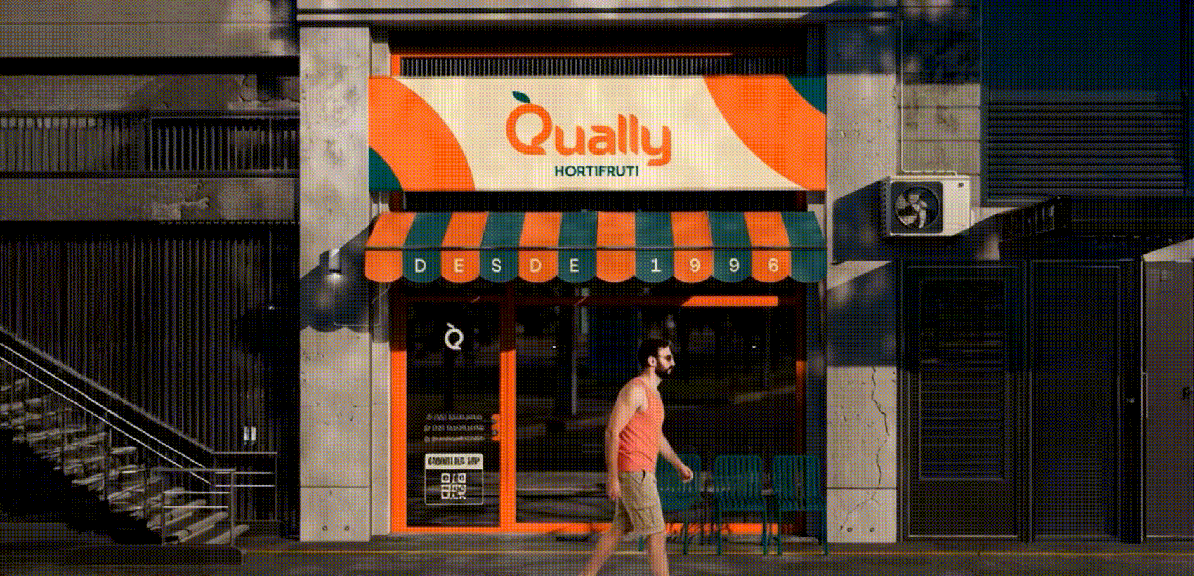
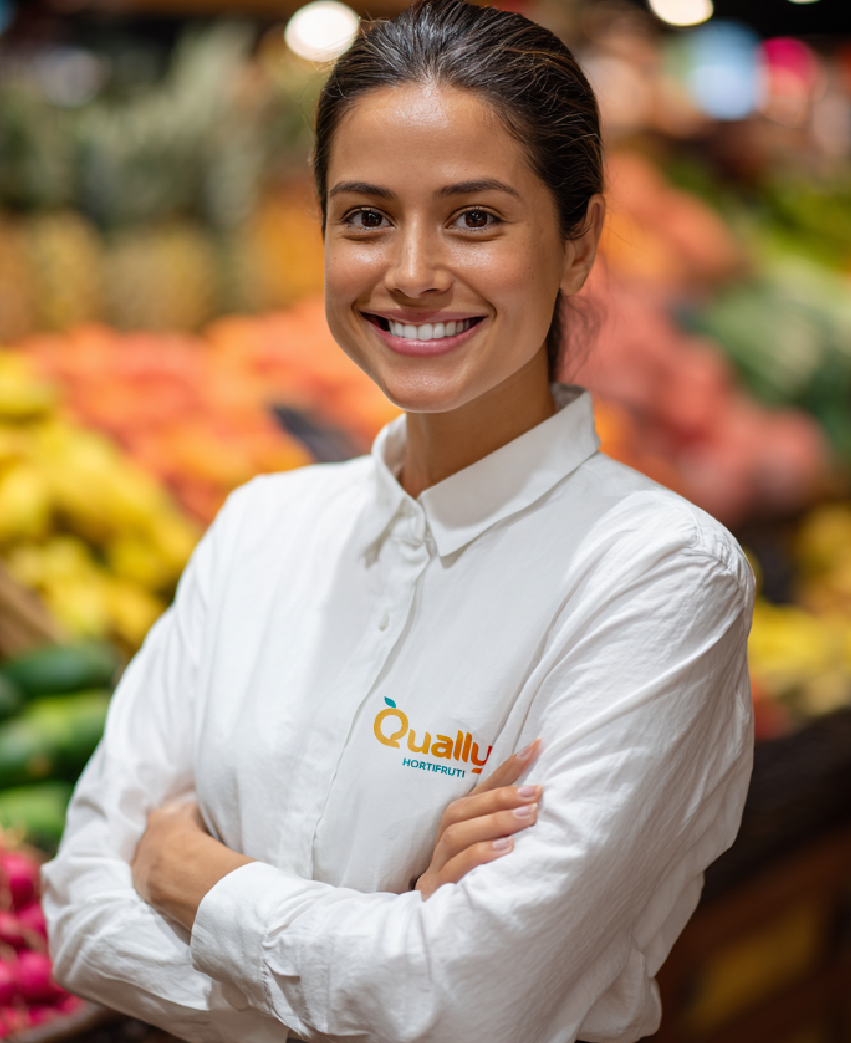
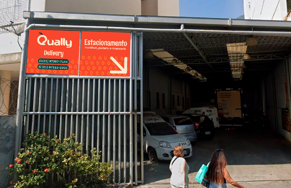
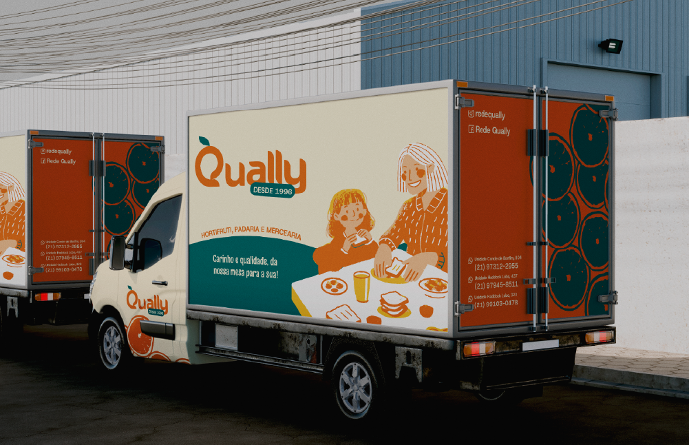
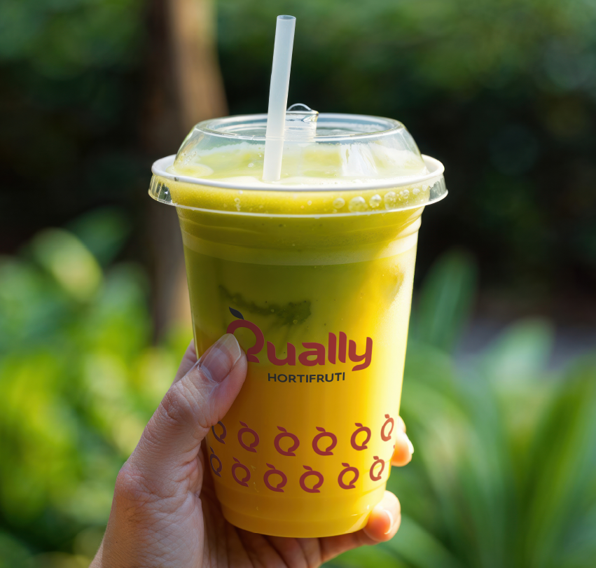
A Rede Qually é uma empresa familiar de varejo alimentar nascida em 1996 e trazida para a Tijuca, Rio de Janeiro. Com três lojas próximas ao metrô, evoluiu de hortifruti familiar para operação completa com padaria artesanal, confeitaria e mercearia. Destaca-se no mercado de food retail pelo atendimento humanizado onde 160 funcionários conhecem clientes pelo nome, criando relacionamento genuíno que diferencia a marca de grandes redes impessoais.
O desafio de branding era modernizar a identidade visual em 35-80 dias, atraindo o público jovem 18-40 anos sem perder o público consolidado 45+. Sergio Felipe, diretor-executivo, precisava do primeiro branding estruturado que honrasse a autenticidade familiar enquanto profissionalizava a comunicação para competir com grandes supermercados e pequenos concorrentes focados em preço.
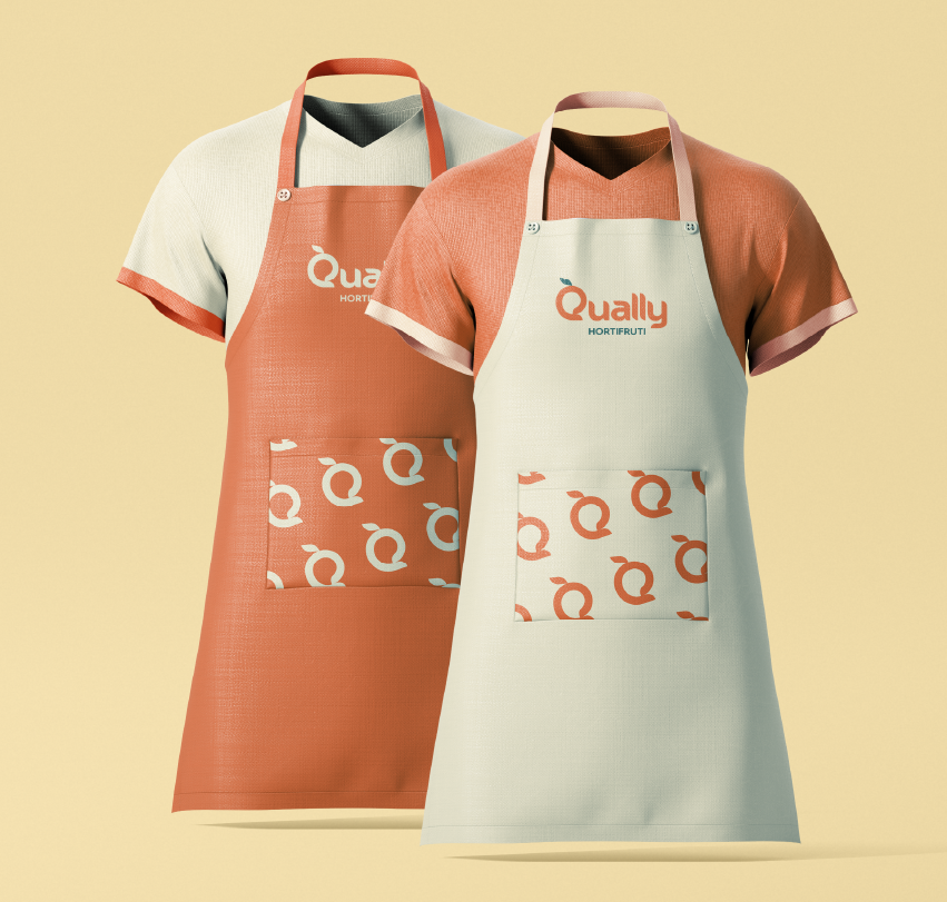
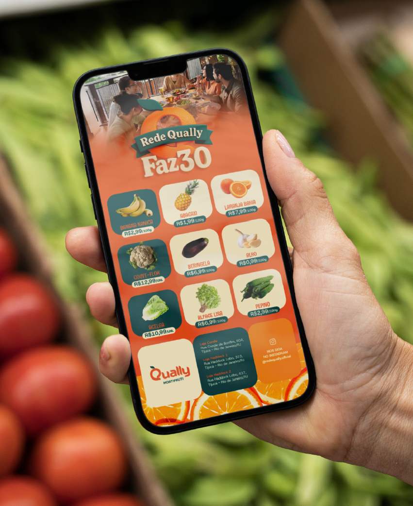
A solução de branding humanizado aplicou o arquétipo do Cuidador com identidade visual em laranja conectando à origem familiar. Desenvolvemos estratégia de marca multi-geracional, três personas detalhadas, guia completo de social media para varejo alimentar e benchmark competitivo. O projeto posiciona a Qually como referência em varejo humanizado no Rio de Janeiro, equilibrando tradição artesanal e inovação contemporânea.
A Rede Qually é uma empresa familiar de varejo alimentar nascida em 1996 e trazida para a Tijuca, Rio de Janeiro. Com três lojas próximas ao metrô, evoluiu de hortifruti familiar para operação completa com padaria artesanal, confeitaria e mercearia. Destaca-se no mercado de food retail pelo atendimento humanizado onde 160 funcionários conhecem clientes pelo nome, criando relacionamento genuíno que diferencia a marca de grandes redes impessoais.
O desafio de branding era modernizar a identidade visual em 35-80 dias, atraindo o público jovem 18-40 anos sem perder o público consolidado 45+. Sergio Felipe, diretor-executivo, precisava do primeiro branding estruturado que honrasse a autenticidade familiar enquanto profissionalizava a comunicação para competir com grandes supermercados e pequenos concorrentes focados em preço.
A solução de branding humanizado aplicou o arquétipo do Cuidador com identidade visual em laranja conectando à origem familiar. Desenvolvemos estratégia de marca multi-geracional, três personas detalhadas, guia completo de social media para varejo alimentar e benchmark competitivo. O projeto posiciona a Qually como referência em varejo humanizado no Rio de Janeiro, equilibrando tradição artesanal e inovação contemporânea.
EN
Qually Network is a family-owned food retail company founded in 1996 and established in Tijuca, Rio de Janeiro. With three stores near the subway, it evolved from a family-run fruit and vegetable shop into a full-service operation with an artisanal bakery, confectionery, and grocery store. It stands out in the food retail market for its personalized service, where 160 employees know customers by name, creating genuine relationships that differentiate the brand from large, impersonal chains.
The branding challenge was to modernize the visual identity in 35-80 days, attracting a young audience aged 18-40 without losing the established 45+ customer base. Sergio Felipe, CEO, needed the first structured branding that honored the family's authenticity while professionalizing communication to compete with large supermarkets and smaller competitors focused on price.
The humanized branding solution applied the Caregiver archetype with an orange visual identity connecting to the family origins. We developed a multi-generational brand strategy, three detailed personas, a complete social media guide for food retail, and a competitive benchmark. The project positions Qually as a reference in humanized retail in Rio de Janeiro, balancing artisanal tradition and contemporary innovation.


PT-BR
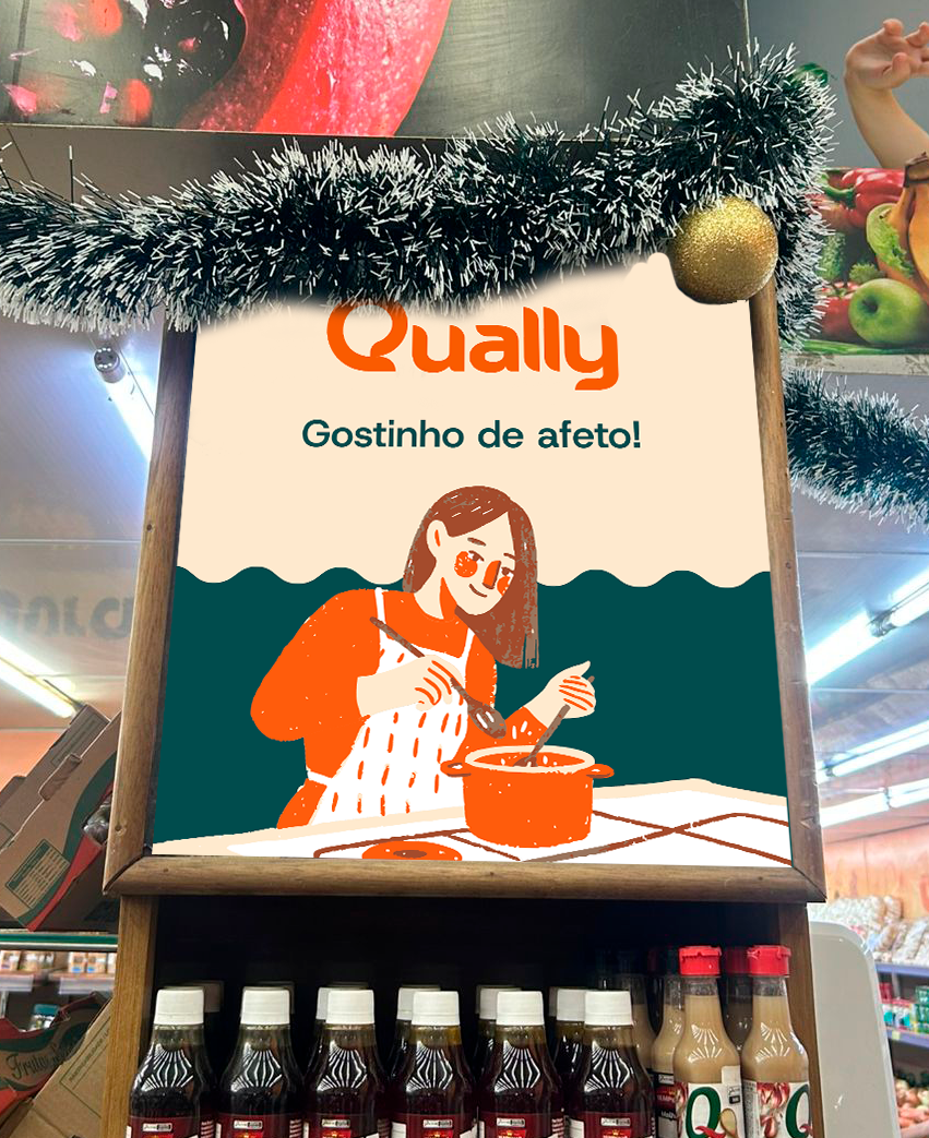
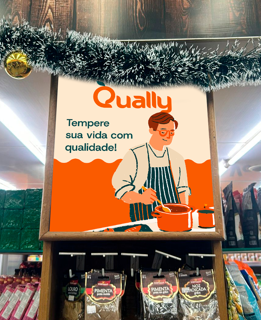
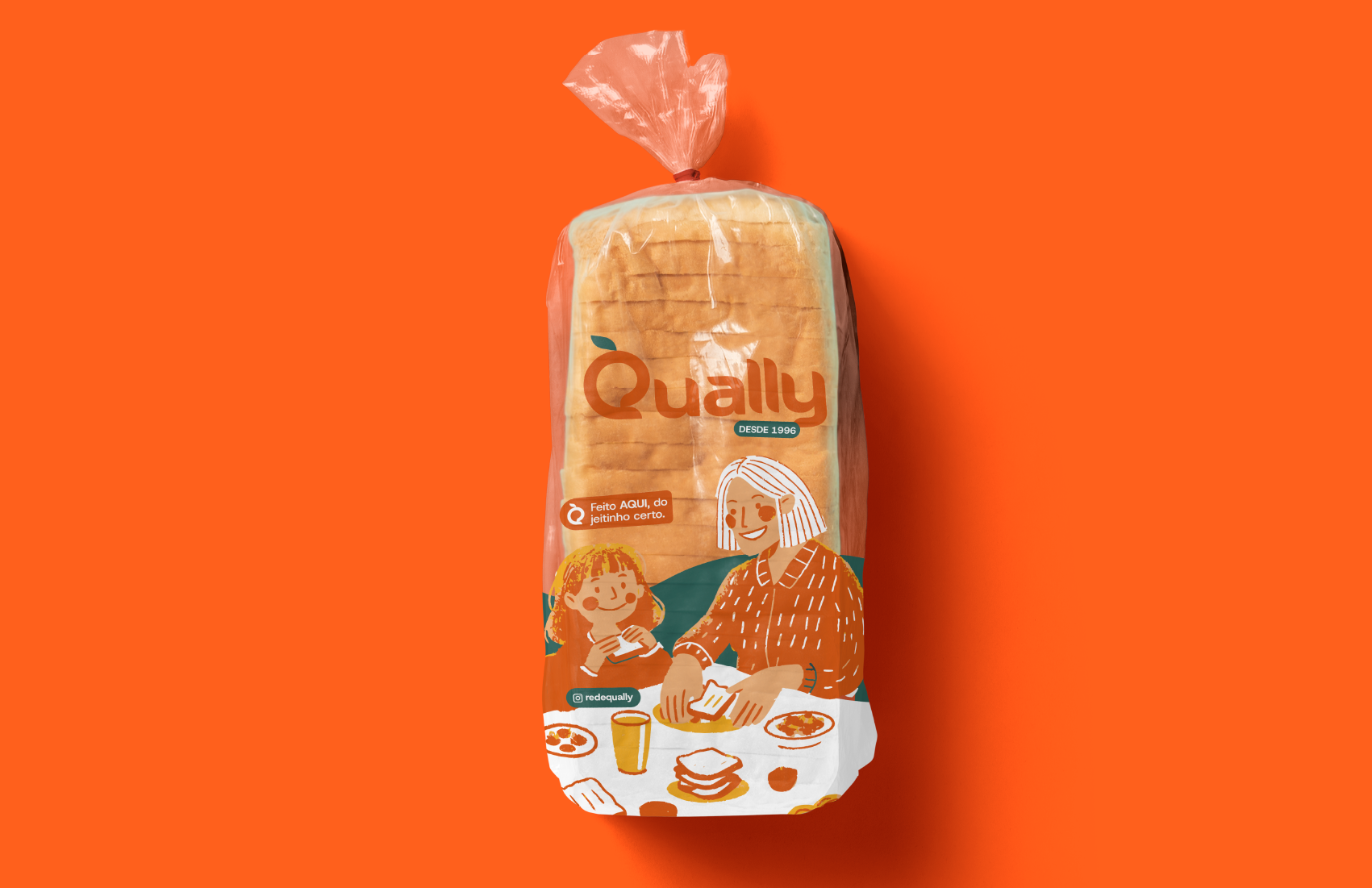
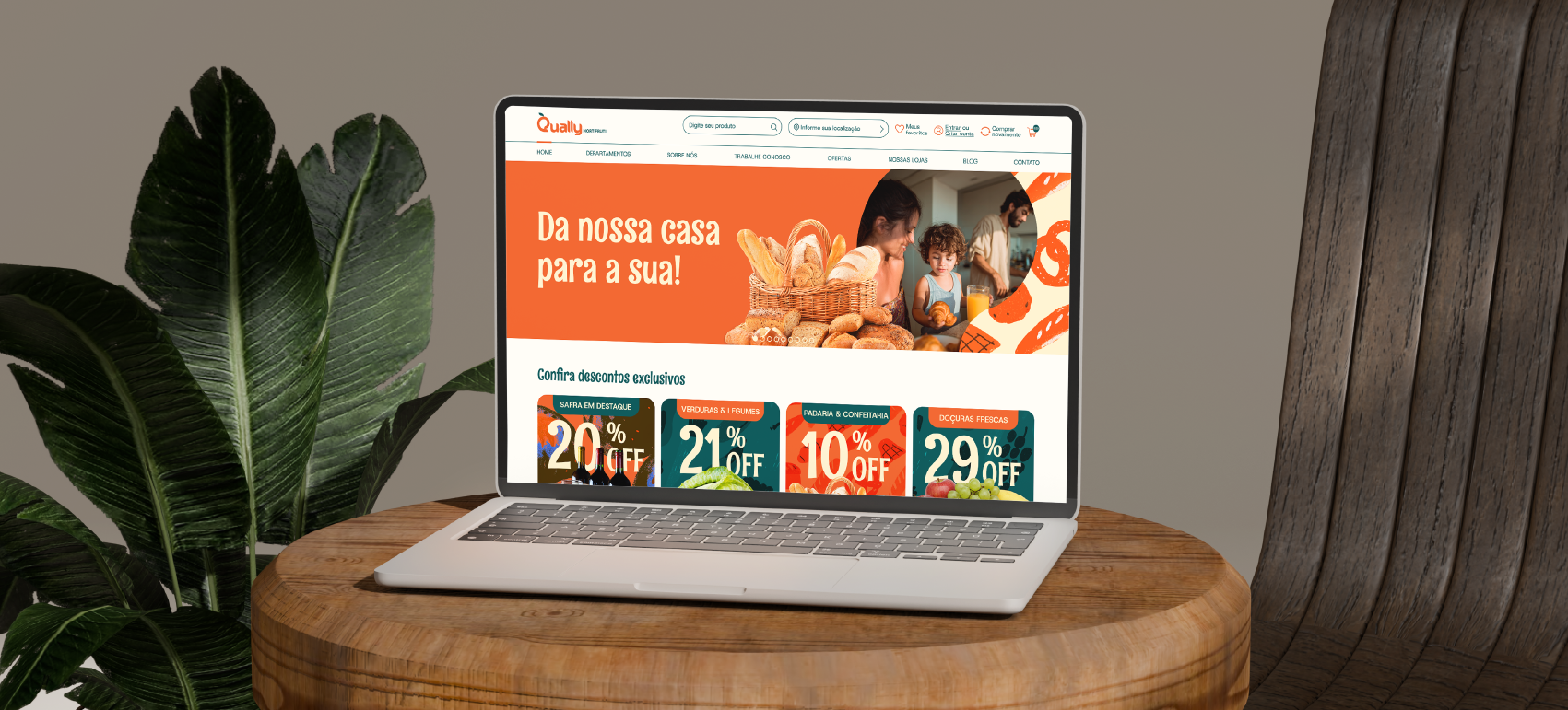
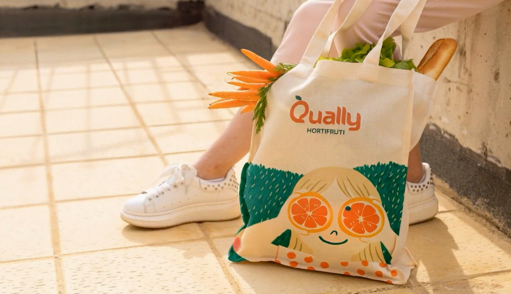
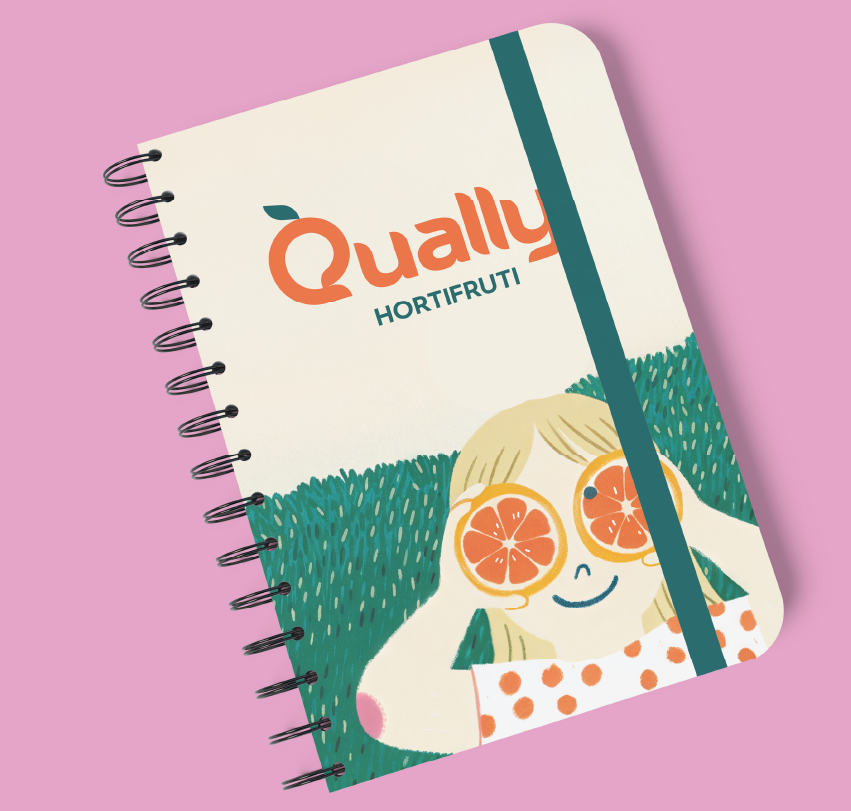
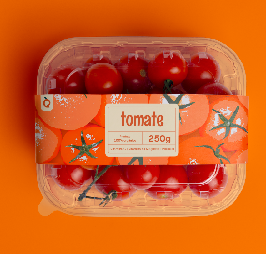
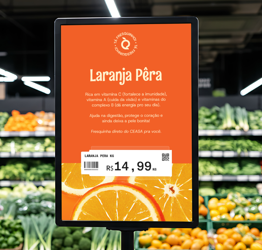
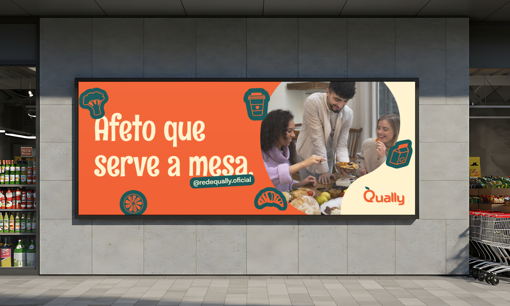
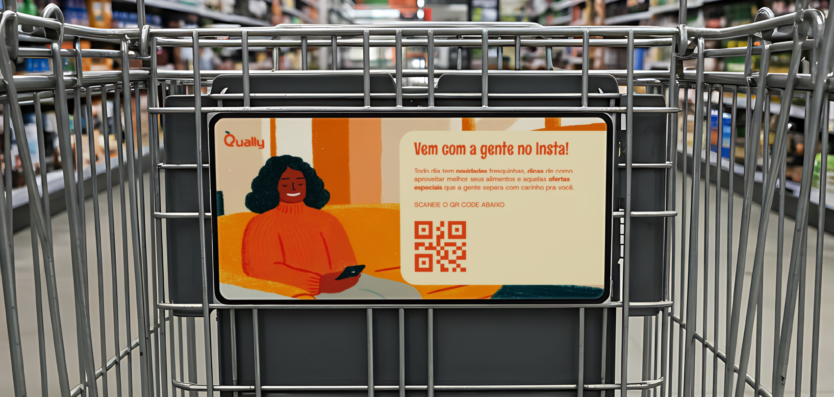
Criamos um sistema de ilustrações orgânicas com traços que remetem a desenhos feitos à mão com giz de cera, traduzindo visualmente a autenticidade artesanal e o calor humano da marca. A iconografia desenvolvida segue a mesma linguagem com traços irregulares e orgânicos, reforçando o toque humano em cada elemento gráfico. Essa escolha de design visual contrasta intencionalmente com a frieza corporativa de grandes redes, evocando memórias afetivas e imperfeição genuína que conectam diferentes gerações de clientes.
O estilo ilustrativo orgânico e a iconografia artesanal permeiam toda a identidade de marca, desde sinalização até materiais digitais, criando consistência visual única no segmento de grocery branding. As formas orgânicas, texturas artesanais e ícones com traços imperfeitos refletem o frescor natural do hortifruti e o cuidado manual da padaria, traduzindo graficamente 28 anos de tradição familiar em linguagem visual humanizada, contemporânea e acessível que dialoga simultaneamente com público consolidado e emergente.
EN
We created a system of organic illustrations with strokes reminiscent of hand-drawn crayon drawings, visually translating the artisanal authenticity and human warmth of the brand. The iconography developed follows the same language with irregular and organic strokes, reinforcing the human touch in each graphic element. This choice of visual design intentionally contrasts with the corporate coldness of large chains, evoking affective memories and genuine imperfection that connect different generations of customers.
The organic illustrative style and handcrafted iconography permeate the entire brand identity, from signage to digital materials, creating unique visual consistency in the grocery branding segment. The organic shapes, handcrafted textures, and icons with imperfect strokes reflect the natural freshness of fruits and vegetables and the manual care of the bakery, graphically translating 28 years of family tradition into a humanized, contemporary, and accessible visual language that simultaneously engages with both established and emerging audiences.