PT-BR
A ShareHost é uma empresa que, através do marketing digital e do seu serviço de hospedagem de sites, busca posicionar seus clientes de forma sólida e estratégica no mercado fazendo uso da tecnologia e do mundo digital.
O redesign da identidade da marca teve como objetivo posicioná-la no mercado como uma marca moderna e inovadora, fazendo jus ao seu arquétipo, o Criador, que tem sede e fome por inovação.
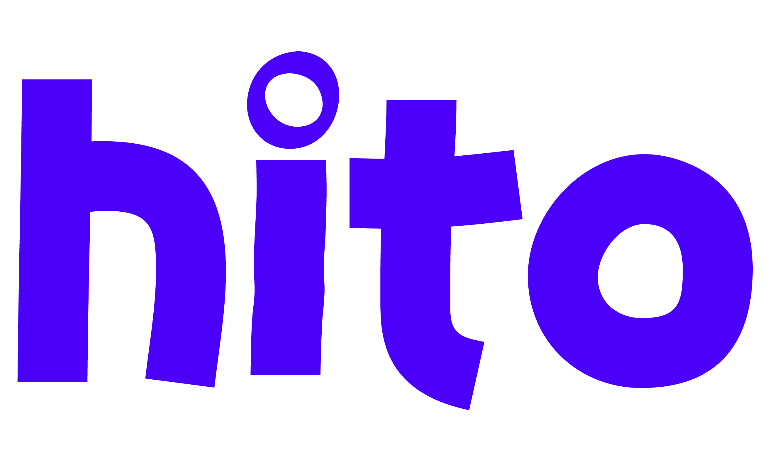
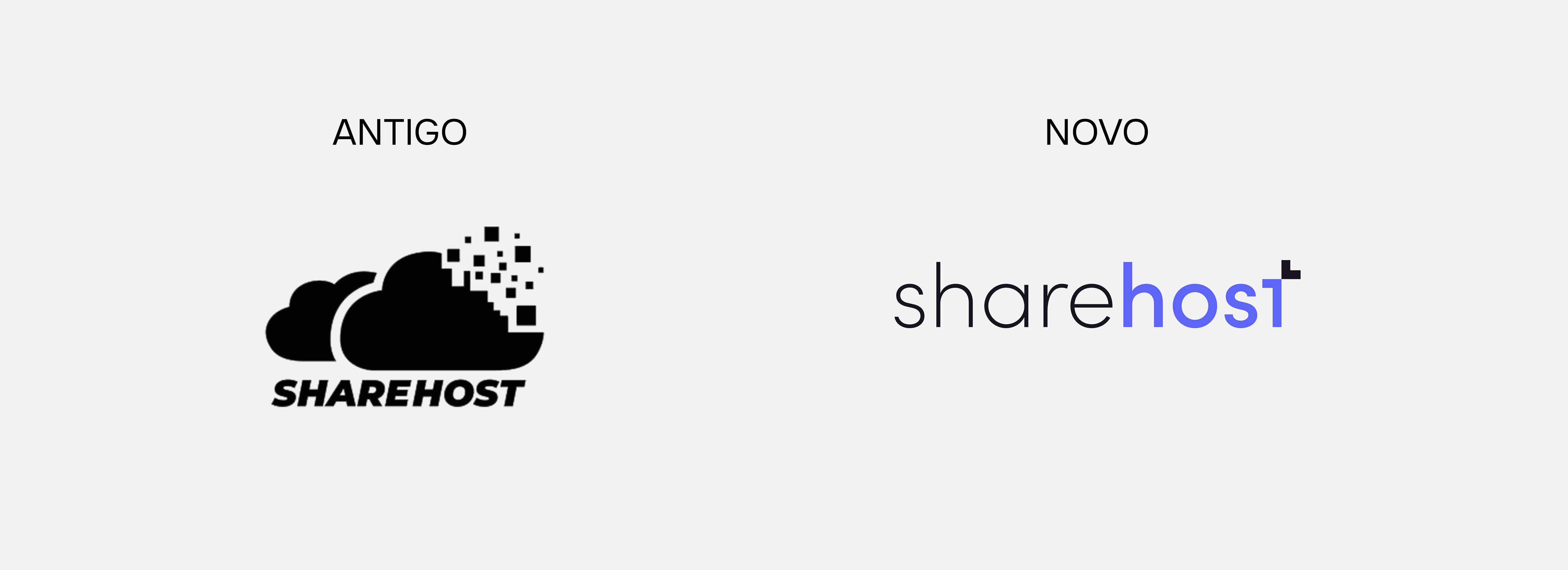
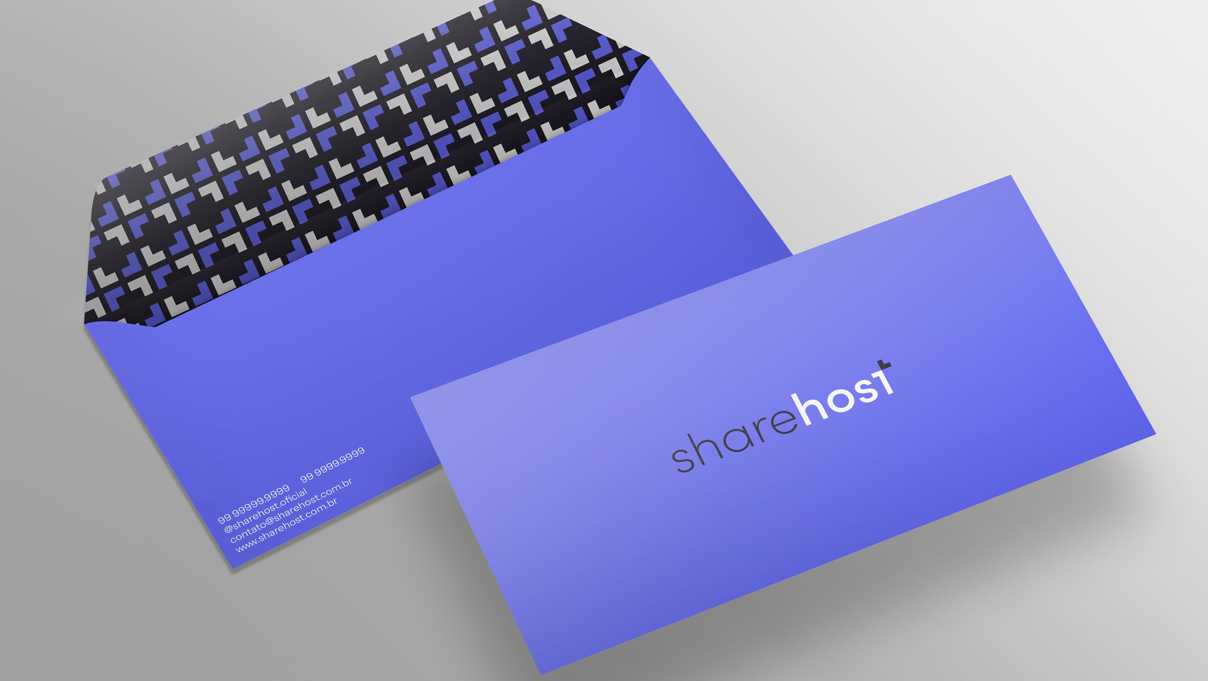
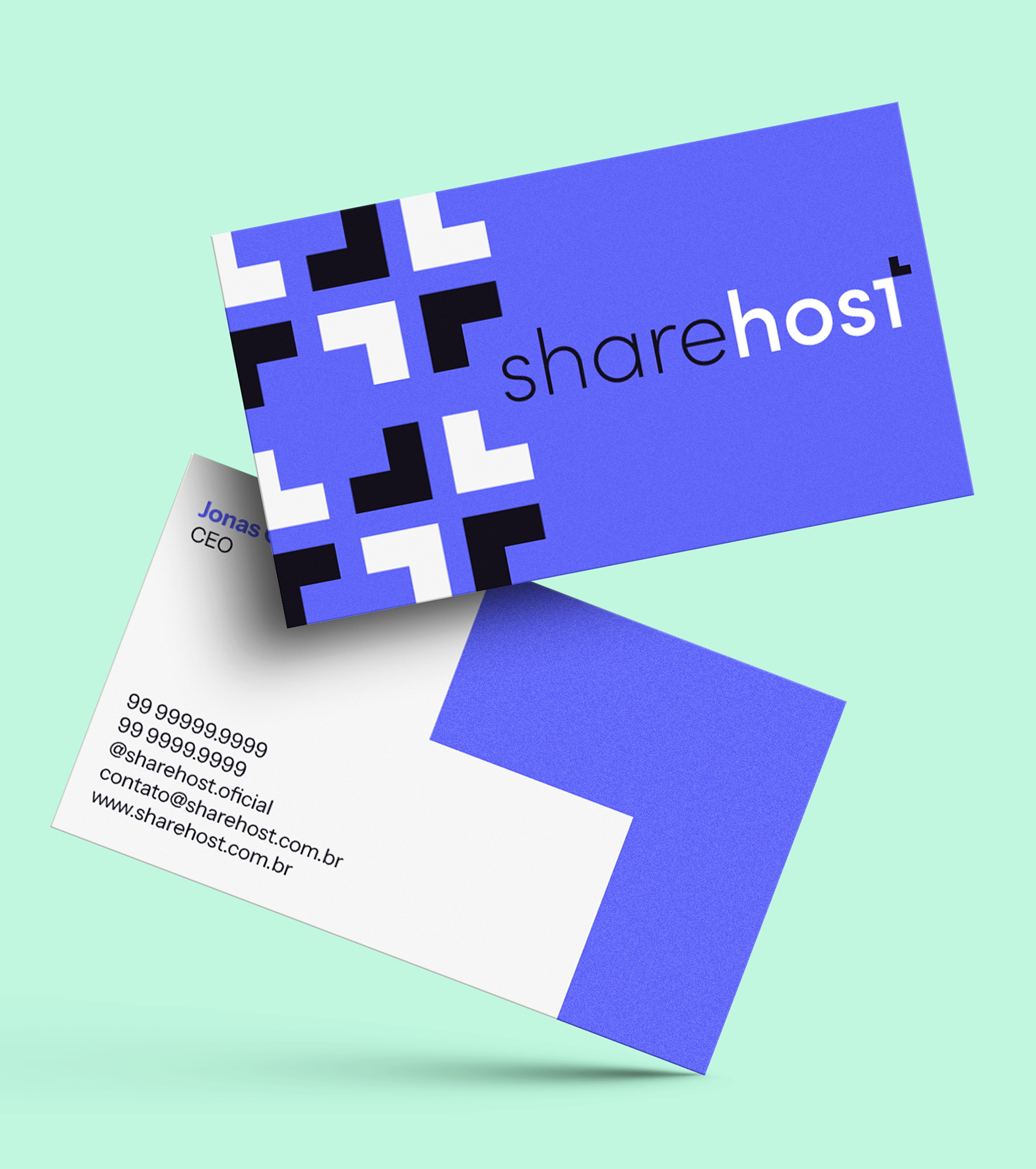
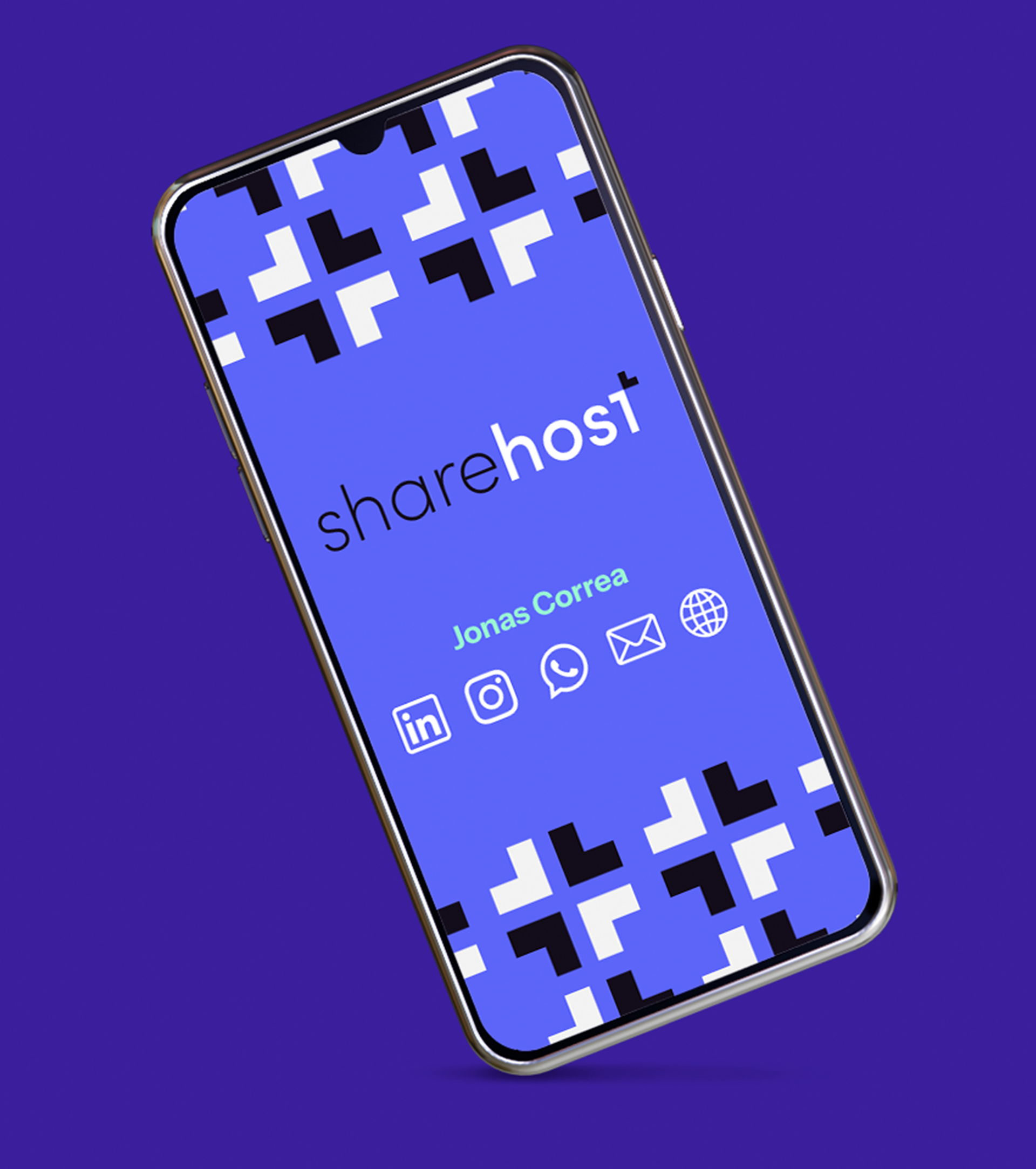
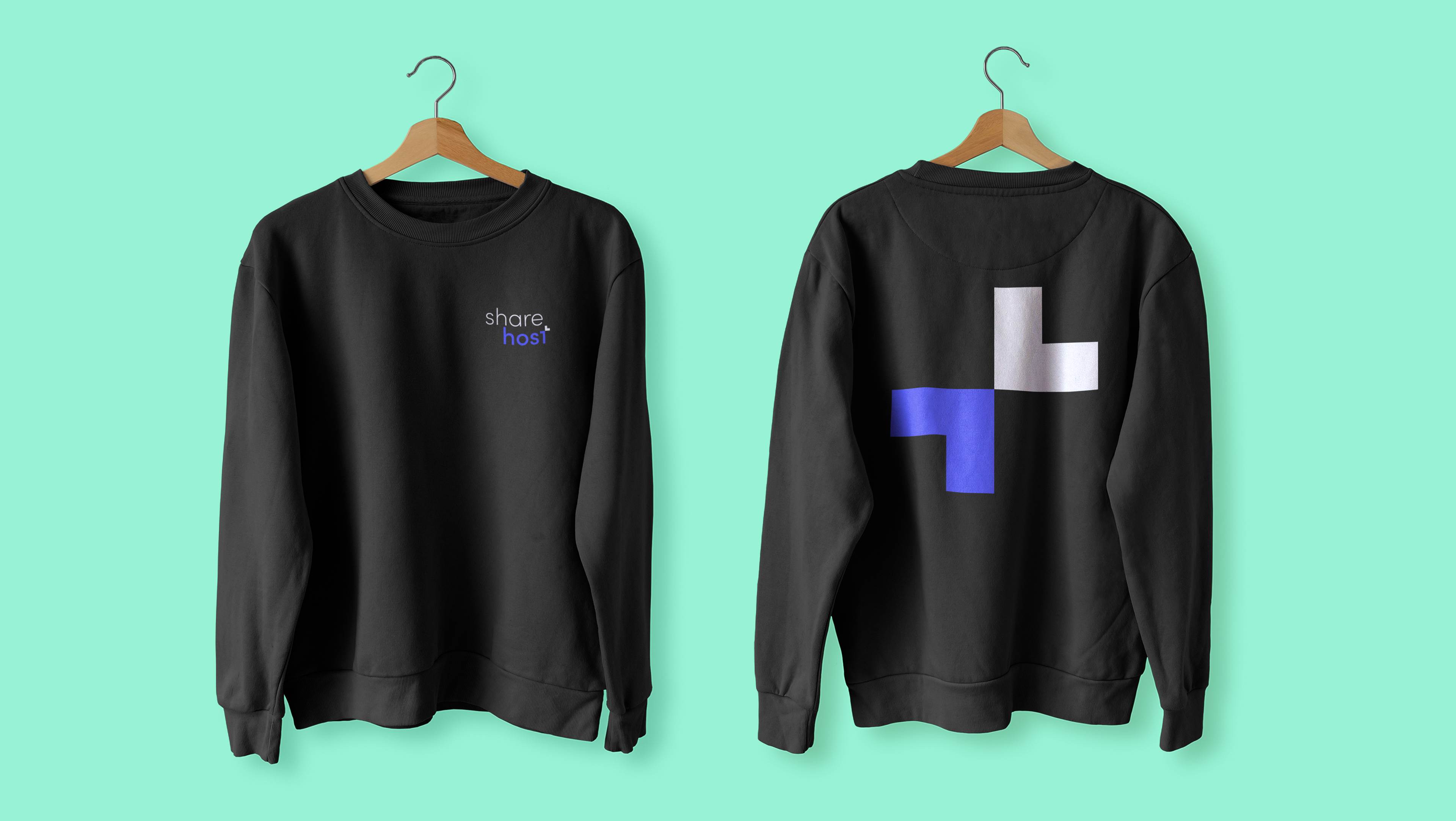
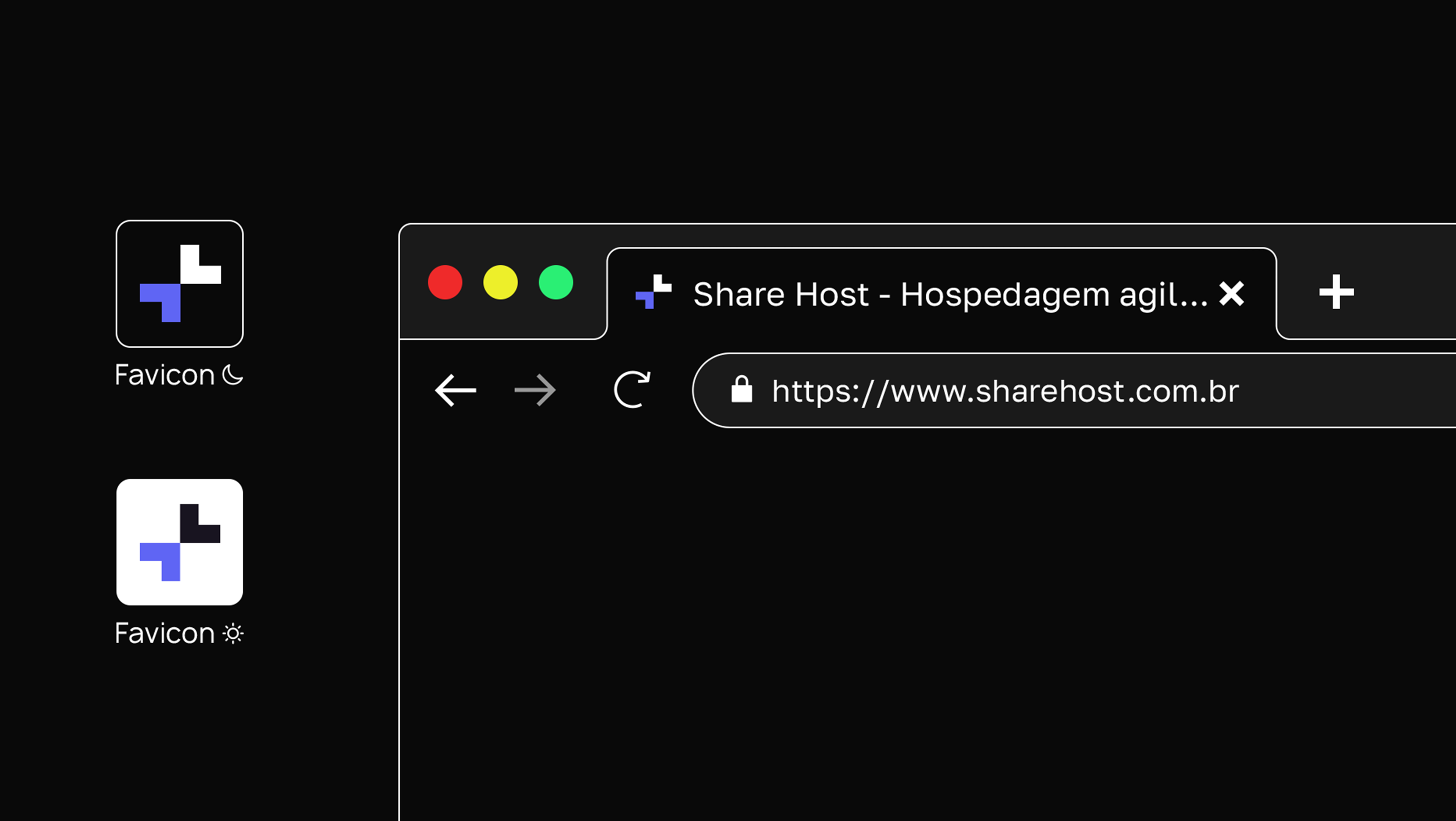
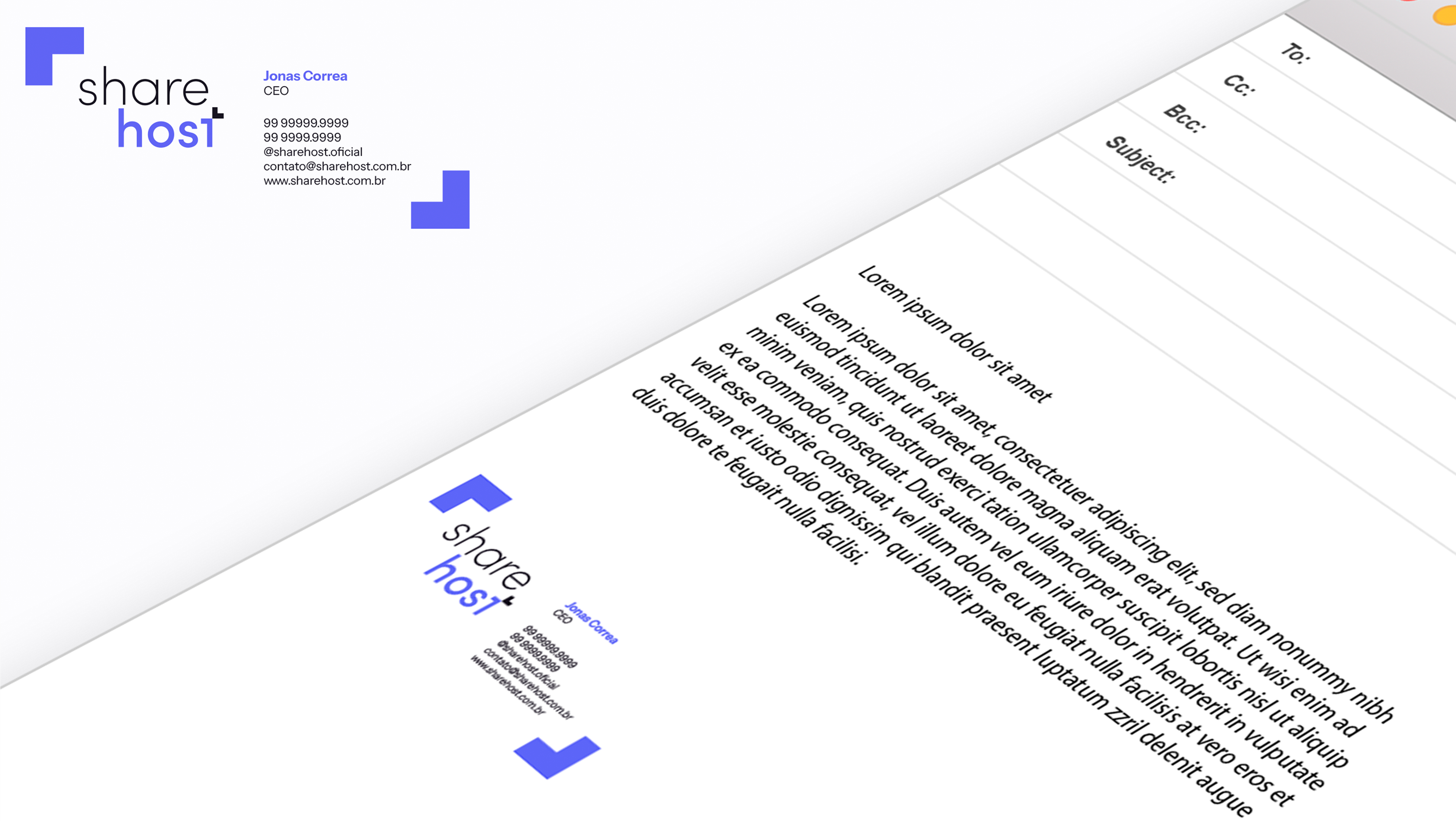
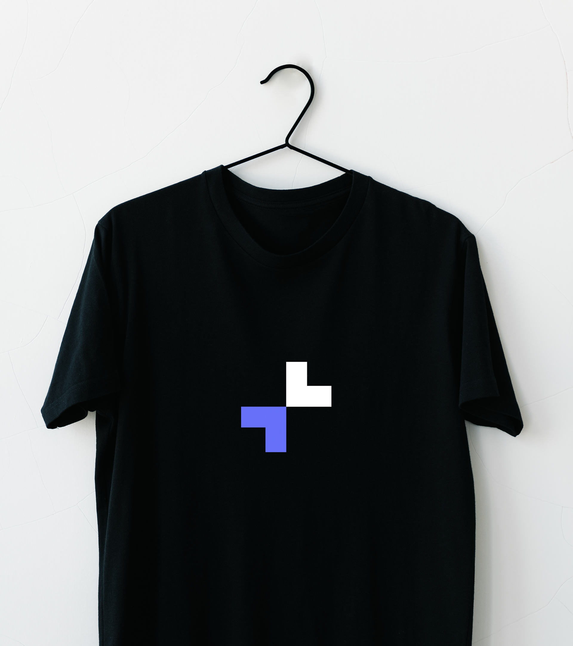
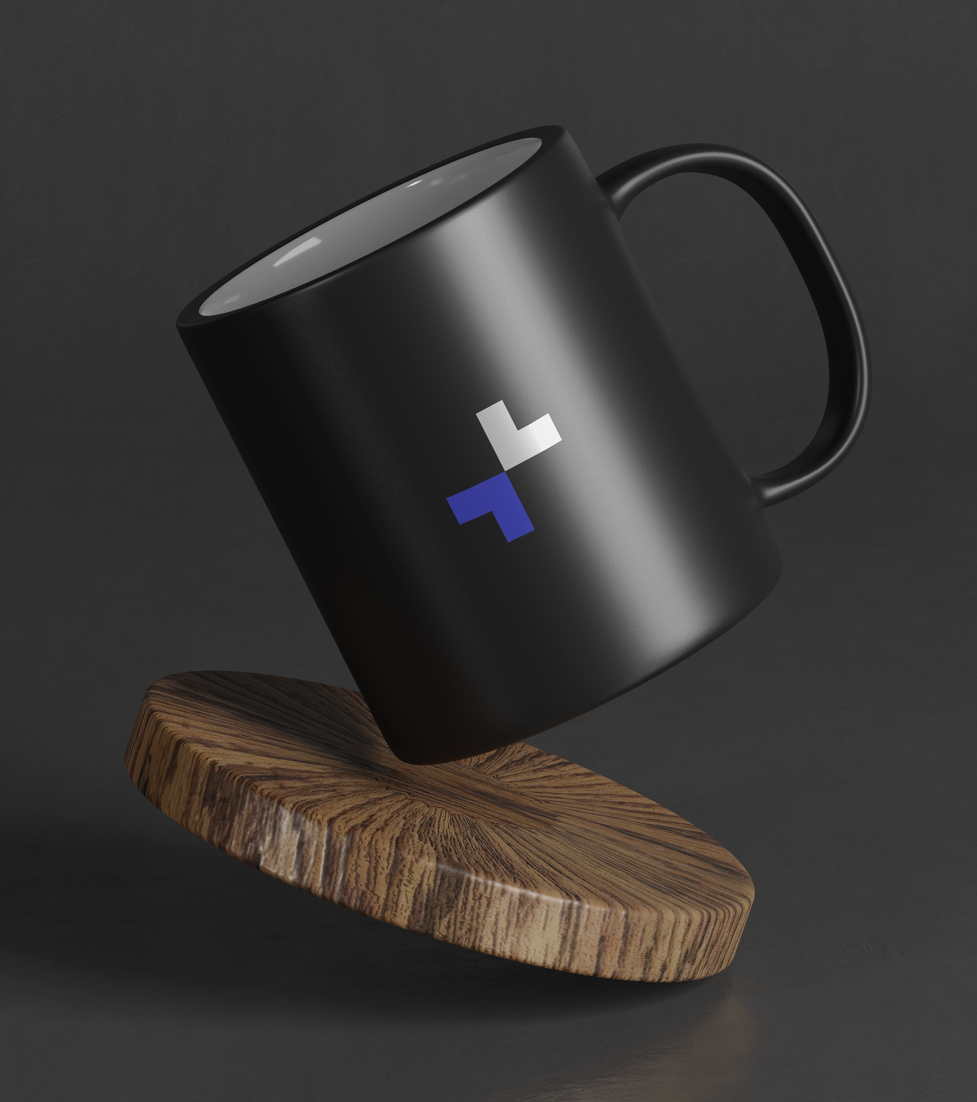
Para o nome, trouxemos duas setas formando a letra “t” ao final do nome da marca, que na versão reduzida transforma-se em um +, comunicando uma marca que veio para somar para seus clientes em âmbito digital. Essas setas fazem referência a programação assíncrona. O conceito dessa programação propõe mais compartilhamento, agilidade, liberdade e praticidade nas ações do usuário.
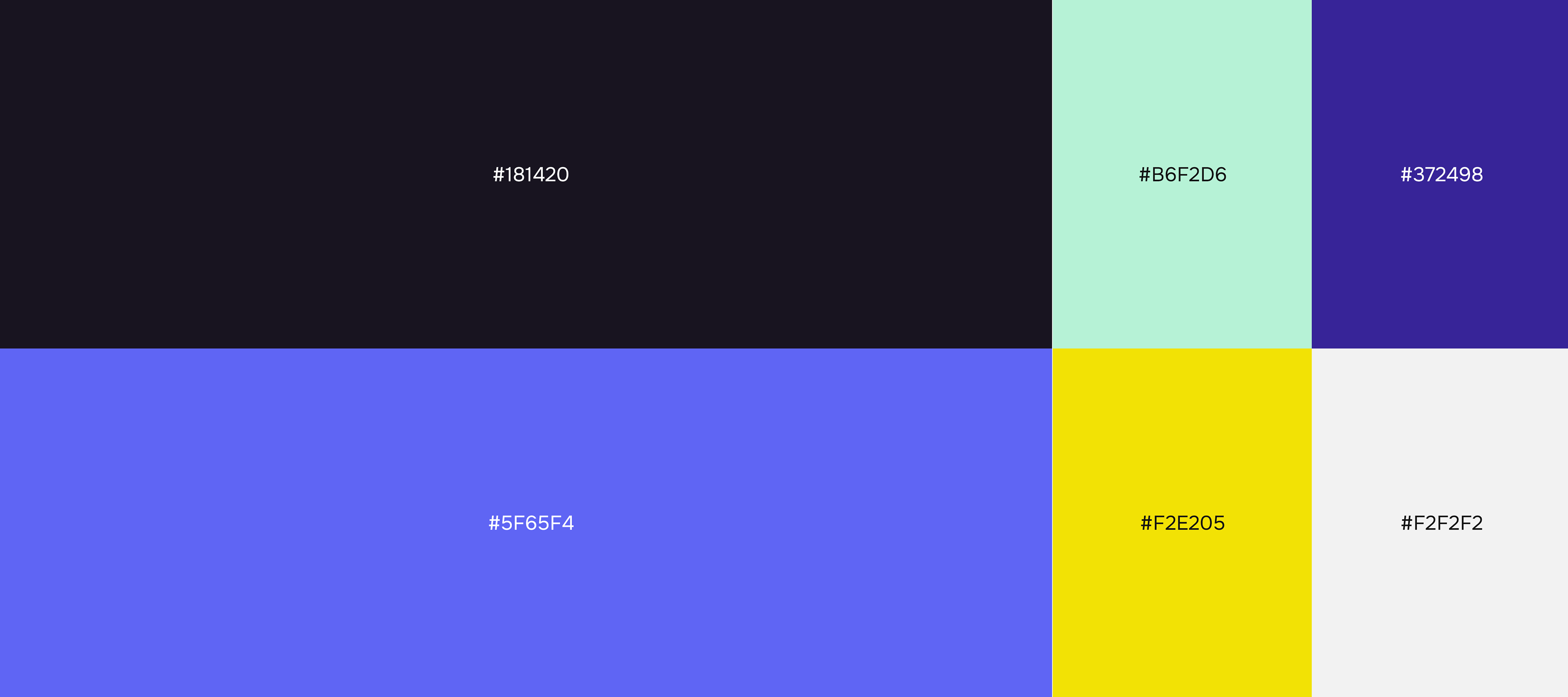
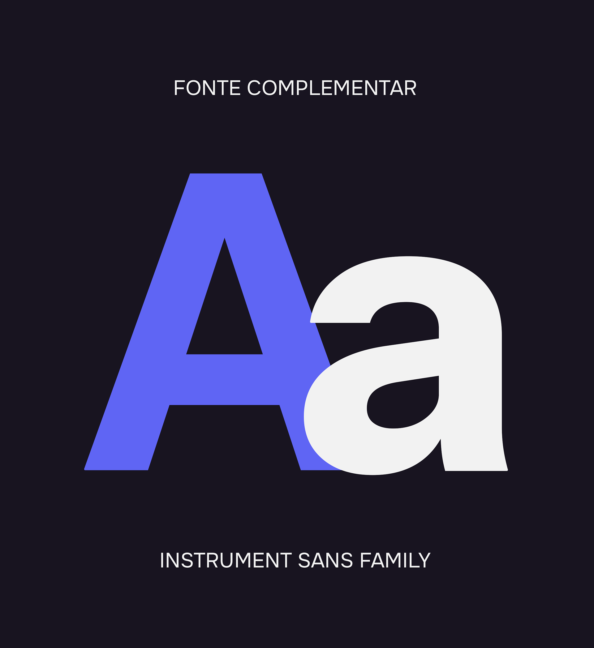
A tipografia, assim como as cores que compõem a paleta da marca, estabelece uma comunicação estável entre seu arquétipo e suas personas modernas e dinâmicas, estabelecendo-se no mercado como uma marca amigável e acessível, além de robusta e segura.
A ShareHost é uma empresa que, através do marketing digital e do seu serviço de hospedagem de sites, busca posicionar seus clientes de forma sólida e estratégica no mercado fazendo uso da tecnologia e do mundo digital.
O redesign da identidade da marca teve como objetivo posicioná-la no mercado como uma marca moderna e inovadora, fazendo jus ao seu arquétipo, o Criador, que tem sede e fome por inovação.
Para o nome, trouxemos duas setas formando a letra “t” ao final do nome da marca, que na versão reduzida transforma-se em um +, comunicando uma marca que veio para somar para seus clientes em âmbito digital. Essas setas fazem referência a programação assíncrona. O conceito dessa programação propõe mais compartilhamento, agilidade, liberdade e praticidade nas ações do usuário.
A tipografia, assim como as cores que compõem a paleta da marca, estabelece uma comunicação estável entre seu arquétipo e suas personas modernas e dinâmicas, estabelecendo-se no mercado como uma marca amigável e acessível, além de robusta e segura.
EN
ShareHost is a company that, through digital marketing and its website hosting service, seeks to position its customers in a solid and strategic way in the market, making use of technology and the digital world.
The redesign of the brand's identity aimed to position it in the market as a modern and innovative brand, living up to its archetype, the Creator, who is thirsty and hungry for innovation.
For the name and also, we brought two arrows forming the letter “t” at the end of the brand name, which in the reduced version becomes a +, communicating a brand that came to add to its customers in the digital field. these arrows refer to asynchronous programming. The concept of this programming proposes more sharing, agility, freedom and practicality in user actions.
The typography, as well as the colors that make up the brand's palette, establish a stable communication between its archetype and its modern and dynamic personas, establishing itself in the market as a friendly and accessible brand, as well as robust and safe.


PT-BR
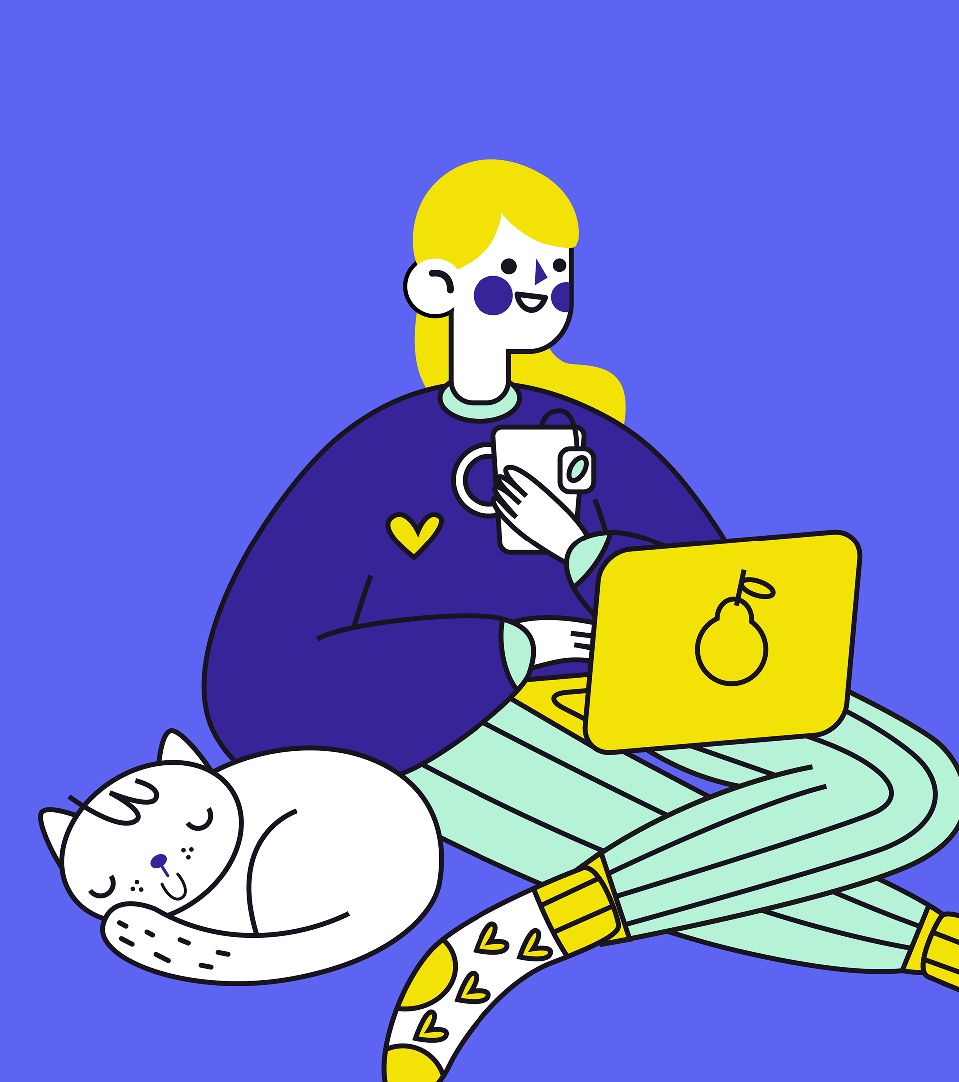
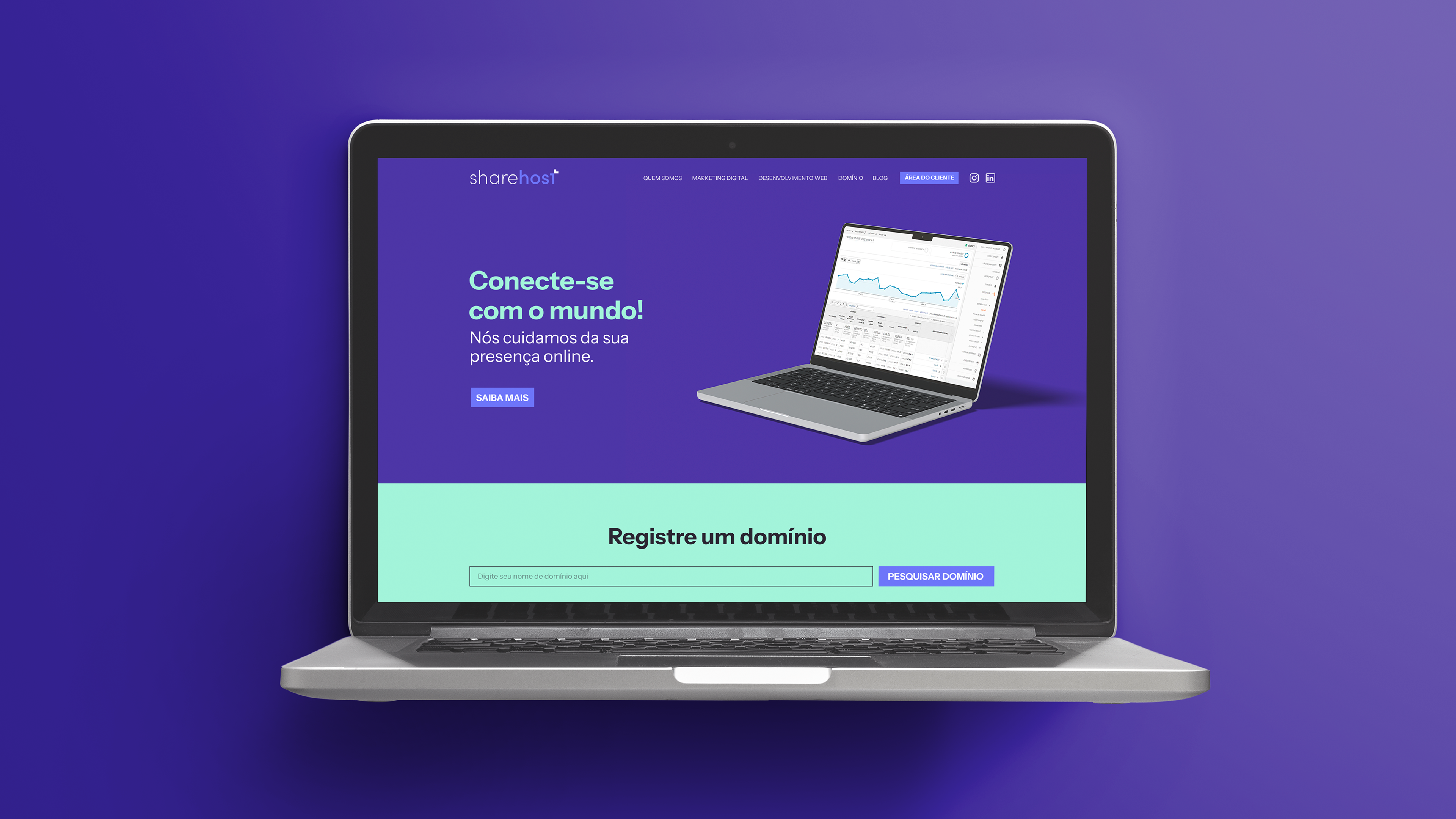
A adoção de ilustrações em alguns momentos da marca, funciona para mostrar que sua comunicação é aberta e para aqueles que desejam se aventurar e criar em sua plataforma um site, comunicação facilidade e agilidade no processo, além de uma equipe mais do que pronta para ajudar.
A adoção de ilustrações em alguns momentos da marca, funciona para mostrar que sua comunicação é aberta e para aqueles que desejam se aventurar e criar em sua plataforma um site, comunicação facilidade e agilidade no processo, além de uma equipe mais do que pronta para ajudar.
EN
The adoption of illustrations in some moments of the brand works to show that its communication is open and for those who wish to venture out and create a website on its platform, communication ease and agility in the process, in addition to a team more than ready to help.
The adoption of illustrations in some moments of the brand works to show that its communication is open and for those who wish to venture out and create a website on its platform, communication ease and agility in the process, in addition to a team more than ready to help.